Lucky Little Lunatics, R/L Monroe's latest erotica release, is out! Another one for the sapphics, particularly the monsterfucker sapphics. If you're into Chimera Falin, or any sort of TF, you'll be into this one! You can check out a three page sample and a full list of its contents over on the shop page.
but this is the post where i talk about the process of designing the cover. i had a lot of fun with this one (i mean, i ALWAYS do, but this one had the most ideas generated)

like i said: there were a lot! these were the notes i was given:
"moon imagery important
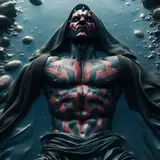
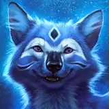
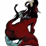
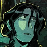
monster girl is a chimera incorporating wolf / stag / owl parts, big monster jaws and sharp teeth are important but otherwise the actual form she takes is open to exploration. she is Large, regardless
it's not an outright vore book but there's definitely a fairy tale style threat of gobble you up
I can give you direction on the three witches she's hunting if you want or need it, but as usual I'm not expecting anything super figurative so it's probably not That important"
so my big takeaways are: moon, obviously. A Monster, fairy tale vibe, and the three witches. already we're cooking with iconography, and the style so far with the covers has been largely silhouette. so obviously we have to do something with a big prominent moon, and obviously the title is going to go there. like that's a no brainer. if you need to have a big prominent circle, you put the title there.
i presented the first six to lee and he liked 2, 5, and 6 the most. we moved forward with 6 because the others were ultimately a little Too storybook, and it is after all a book about turning into a monster and chasing down some women you've been hanging out with, for the purpose of fucking them. taking his feedback about making the monster less specified and more oppressive, we ended up with the 8th thumbnail, which ended up being the final!

and then we went through some color variations. i work pretty much Exclusively with gradient maps these days, which make it really easy to iterate on a palette with very little additional work. lee chose the bottom left, so that's what i moved forward with!

we tend to go through a lot when picking these. my first pass was based on the fantasy fairy tale vibe i was still operating under, which we ultimately dismissed. lee wanted something Like the first, simple, font, so i tried a bit more. the crit there was that they ended up looking too much like a bestseller, when what we wanted was something a little less top shelf and more pulpy. we ended up using the top right option, which coincidentally is the font i use for the cover of You're A Mage on Monsterfuck Mountain. apparently that font is just for monsterfuckers
and that's more or less it! there wasn't a whole lot of process between thumbnails and thumbs, just plan and execution. i think my favorite part of the cover is the little witches holding hands and running away. they charm me.
anyway you should go read the book! it's very good. it has big monster tongue stuff AND tail stuff. truly a monsterfucker's paradise
Parker Hoover
2024-07-02 22:33:16 +0000 UTC