[next page]
so... first page of This. let me try to compose my thoughts...
1) this is the first comic that i'm doing with thumbnailing it in advance first. i wanted to thumbnail all of it before starting buuuttt i ran into various snags. most of it the script is thumbnailed out, basically all i have to do is the closing portion.
i'm guessing it'll be about 11 pages, but i'll say how many it is in hard numbers when i finish those.
how i feel about thumbnailing so far... it makes sketching a lot easier. in exchange, i usually need to review the page several times to make sure there's no continuity errors. for example:
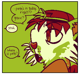
i originally thumbed this with felix's hat backwards. i sketched the latter half a couple days later, and noticed while checking it over.
i even have some continuity notes written on the thumbnails to note when sketching later (for example, a couple of pages i thumbed izzi gesticulating with one or both hands like you would using a steering wheel, but realized going over those that she needs one hand on the modified gas pedal to continue driving).
i can't say that this is exclusive to thumbing, but it's been interesting so far. i only really got emotionally invested into the story and "inspired" to work on it about 8 pages into thumbing. it seems like i tend to start "feeling" a story during the later middle half. kinda makes sense... all the exposition is out of the way, etc.
2) the color scheme... i still feel like something's "off" about the 2 midtones, but it's pretty neat to look at as-is. still very "fallout" to me, but i don't necessarily MIND. this was the original intended color scheme:
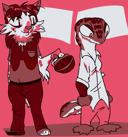
i like the old schemes "8-bit" look, but it was a LOT more one-note and a little too foreboding tonally.
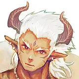
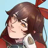
3) i've been wanting to tweak felix's design a bit. i've been trying to do so in a way that isn't really a RETCON as much as style evolution. their proportions aren't quite as stylized as i wanted, no clean division lines... i've been MORE satisfied with the reworked design, but it still feels a little cramped.
i usually need to have a ref of them open because they have these specific spots as a calico, and i usually don't consider a design i can't completely remember in my head acceptable. i'll see what i can do with it.
working with the color scheme, i've also been trying to "push" stylistic liberty with designs a little more knowing that the palette is limited, and needs to be more aesthetically pleasing than on-model.
for example, felix's eye markings were originally literal translations, then i went for "bottom lid red midtone, upper lid green with the grey overlap stylized out"... then decided their entire eye marking looked better as the red-orange instead.
it's still a little challenging mentally. i'm a very literal-minded person.
that's about it. looking forward to the comic, hope you all enjoy it. once i finish thumbing and tweaking the pacing and editing of the writing in there, i already have 2 options up for the next side comic poll, which will also be about felix, but specifically their alters instead.
i thought it was a little unfair, but thinking about it more... each of them is like a different character in a larger story. they'll never all get some development of their own if i have to constrict them to "only when felix hasn't gotten a turn in a while."
rabbitwarden
2018-09-11 18:27:25 +0000 UTCKhyle
2018-09-11 07:23:38 +0000 UTC