Hey everyone!
Here's a brief introduction to my process behind 'Game Over', my latest illustration. The intro is divided into concept development and technical execution. Enjoy.
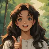
I thought it would be interesting to do some kind of tribute to Nintendo, so I took this as an opportunity to include a series of '90s props in this composition, along with a keyboard jacket I've saved some time ago. The key idea is self-evident: a girl who just lost a match and the "game over" is actually happening in real life, by turning her into pixels that are later absorbed by the Nintendo device.
While searching for props that fit the theme, I found an interesting POV picture that gave me the idea of making the character upside down, as if she were experiencing this pixelation process while lying on the floor. I thought it would be a novel way to present this idea.

The list looked pretty much like this:
Although the concept initially was upside down, I turned the canvas to the opposite side as if it were not. This was to build the character the traditional way; it would have been a nightmare just trying to guess shapes upside down. However, after a while, once I turned the canvas to the expected position, the character looked off.
I'm still not particularly sure about what was off, but it didn't feel like she was on the ground; instead, it looked like she was falling. My approach was to work initially with the canvas in a normal position and then turn it upside down to make corrections. I noticed several issues, but the one worth mentioning was the position of the head. Initially, it looked like it was leaning back. The correction made it look like she was actually resting her head on the floor by tilting her head forward. If I've failed to explain this, please check the process video.
The color palette was a variation of greys and reds, mostly matching the Nintendo device. Greys were distributed among cloth pieces, like the jacket being different from the hair, etc., in a way that they could create contrast. I also used black in places like the leggings and T-shirt so the composition didn't look too bland. This was to balance the lack of strong fabric folds as well.
Reds were used in smaller areas like the shorts and eyes, just as a breaking point from the sober tones offered by greys, whites, and blacks. You cannot fully perceive these color choices from the final piece as I did a lighting treatment to push the palette to different cold tones. This was through the use of blending mode layers (light and shadow) and adjustments with selective color. Please check the PSD file to get my point.
Conclusion
Although it's true I've created upside-down pieces in the past, I did not feel particularly comfortable trying this one. This is because lately, I'm not using references for full-body gestures, mostly for fabric, so perhaps I'm not as sharp as when I have a real-world guide. But I think that's fine; it's important to push skills beyond boundaries to improve. Try it out and let me know if you had more luck than me.
I hope you enjoy the content, and thank you for your support!