Orange and Blue, fight to the death!
Added 2021-03-03 03:59:24 +0000 UTCDear Insane Children,
Font Lord here with another poll for you to take part in.
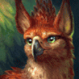
As you might remember from the recent poll where I asked what art prints we should be doing this year, the next one we have lined up (for those charged in April) is the one below, the orangey floating castle.

However, with all the great new art we have rolling in, we do think about swapping out some of those choices, as we said we might.
American would actually like to adorn his walls with sakura now that Spring is right around the corner, so has suggested we swap out the orange print for the blue image with pink sakura leaves.

What do you think?
We will bow to the will of the masses and do what our Patrons suggest, no matter even if it makes American cry.
Cast your vote below for what you think the next print should be!
- Cheers
Comments
The blue one is perfect for spring and I love it! I think the floating castle would be nice for autumn <3
2021-03-15 18:14:56 +0000 UTCLove them both so it was a tough choice!!
Sarah McKeegan
2021-03-05 22:27:54 +0000 UTCBoth is good, but blue first.
RedBreloom
2021-03-05 01:35:57 +0000 UTCI want both so I hope that means that one of them comes later for sure!
2021-03-04 17:25:47 +0000 UTCThe answer both is missing
2021-03-04 02:25:18 +0000 UTCthey are both awesome but i liked orange fire castle more
Lucas Severin
2021-03-04 02:10:03 +0000 UTCThis blue is m favorit color so it was an easy choice for me :D
2021-03-03 17:12:18 +0000 UTCI concur with so many others, I hope they're both made available.
2021-03-03 16:15:47 +0000 UTCSoo difficult to choose 😫. Both are so cool !
2021-03-03 09:39:03 +0000 UTCAs long as they both make it into the artbook later down the line I'm good with either, lol
Destiny Jenson
2021-03-03 07:54:00 +0000 UTCI'm hoping to see the sakura print sometime, if not this month then hopefully sometime in the future
2021-03-03 07:31:12 +0000 UTCThis is a hard one... Hope we may see both prints in the future
2021-03-03 06:45:53 +0000 UTCI really love the floating castle one and I hope it’s put into the rotation sometime this year!
2021-03-03 06:20:06 +0000 UTCI was going to up my Patreon amount specifically for the orange castle print because it was one of the few prints out of the whole line up that was voted on that I actually liked. It was one of two prints that I was going to make sure I got. However I like the blue one and if I could, I'd prefer both prints to be made available. If the orange castle could be moved to a different month (not June) then I'd be happy.
2021-03-03 05:07:20 +0000 UTCI’m a big fan of the blue one. It’s so pretty!
Nicholas Brokaw
2021-03-03 04:43:27 +0000 UTCthe blue is very pretty but far too "light" for my decore. But I hope they both eventually make the cut!
2021-03-03 04:24:59 +0000 UTCBoth are stunning, it was a very hard decision for me. That being said the art in all your games are amazing!
Zach Kondos
2021-03-03 04:06:22 +0000 UTCMartin’s “orange” sure looks a lot like red to me
Lucky Dragon ‘She.They’
2021-03-03 04:02:13 +0000 UTC