SamSuka
americanmcgee
americanmcgee

patreon


Early HUD and UI - Design Notes from Alex

Hi everyone,
Alex here. I am the Design Lead amongst other roles for the Alice: Asylum pre-production project.

My work on the Design Bible last year was focused on delivering the best possible narrative experience for Asylum. From the feedback American and I have received, we've achieved that to a suitable level to proceed.

My work is now focused on presenting key gameplay concepts in the earliest chapter of the DB before the narrative experience begins. Then, I'm typesetting the remainder of the design bible content to create the expected 250+ page finished monster document this year. 

We are in the middle of creating a broad stroke chapter, that will help push and educate anyone to a sufficient level if they've never picked up and played an Alice Game before. 

We answer; What to expect? What is the gameplay loop? What the hell is a Bumby?

While that knowledge might be redundant to everyone who is already a Patron (we all know what a third-person game is and how wicked Alice games are), presenting this information in a concise way for potential investors is another job for the Design Bible to perform as a sales tool.

So, that's what's cooking currently. And we'll have more to share soon.

For now, as an extension of this foundational work in the DB, the video at the top of the post shows some of the early work I've just completed.

A first pass, early days, but I feel these designs communicate the information needed.

A few early HUD concepts for; Health, Rage/Hysteria special states, A New "One-Hit Shield" Mechanic, (represented by the rose), and a very early Weapon Wheel.

So we're sharing them here as they're fresh out of the oven.
Have a look, watch the video, (volume on please), and drop your thoughts in the comments. 

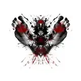
The visual style draws inspiration from some classic games that came before and some remixed elements of Madness Returns.

I wanted it all presented in a legible, concise, and very "Alice" way for Asylum.

Much more progress is being made in other areas in the DB.
I'll be dropping more updates shortly with more new design-orientated Alice stuff as soon as they're ready.

See you in the threads!
Cheers,

Alex

Early HUD and UI - Design Notes from Alex

Comments

I loooove the first design, how Alice's face change.

the heretic hexen style live bar. Memories come alive. Nice.

NecromancerforLife

This all looks fantastic! Great work!

Roicee

I am giddy seeing these health bars and concepts. It really makes this slow forward progress more real. It's happening guys! We're moving toward the goal!

Stephanie Groth

This is wonderful

Saleh Abu-Rashid

For the health bar, I like the first one the most. Its fits the aesthetic and atmosphere of the Alice games the best, I think. However, the fire animation for getting the one-hit shield in number III is cool. Maybe it could be added to number I?

Greyson Kehm

Alex, No. I and II are just lovely! They convey the information needed very well! The animations are smooth and the style intriguing! I do have my problems with No. III though. I'm not a big fan of that style. Apologies. I do think the red and green colour schemes are really good to translate to the player that health is lost or gained, without having them really looking at it. The bleeding heart is a cute gimmick, but I'm not sure how well the player will see it on their screens. For some reasons I'm totally lost about the red symbole of the rage bar. What does it display? Alice? And the flames are not good in my opinion. When they grow to big, they reach beyond the healthbar. They go over the design of the bar itself but not over the white bar. Which is good for readability. Instead they look like they're continue behind the health bar. Which just doesn't look good and is a bit confusing. I'd recomment a pulisng animation instead of flames. Apologies again. I hope this was good critic and didn't sound like a complain. In the end, it's just a personal opinion!

Love the music and look and feel of it so far!!!! Makes me want to replay the other games right now! I love the animations for the first rage bar, with the Alice face. Though I also grew up playing both Doom and Diablo, so I love the similar styles with that as well. It felt fresh still, not like a re-skin of either health bar. Also, wondering if the third graphic was for the limited rage ability? I think that is what it read before it played? I like how simple it is to read. Great job! Very in style I think! Can't wait to see more!!

Karma Chameleon

Yes, the first 90s-like health bar is absolutely amazing and that weapon wheel is a thing of beauty! The second more modern health bar is nice, but I think the aesthetic of the first bar is much better. Great work as always Alex!

Perfect! I like music too. Seriously, there is no other game i am more hyped about than about Alice: Asylum.

Hey Alex, absolutly LOVE what you've done here, i can already feel being in the thick of action! Man does the 90s/2000 HUD look fantastic with the look of degredation it has, and that Alice's facial expression changes too! Will her face be animated to react to hits/damage? Also the weapon wheel will make for slick and quick gameplay, and for some reason i imagined the wheel as the circumfrance of a rose, with weapons placed on the petals, or a pocket watch mechanism (which could look cool if the background made the game look as if it slowed right down and blurred)...that was untill i read about the Chaos symbol which i never thought about haha! And the final HUD, while functional like Wendy said the white a little plain or bright, and the information icons i would use in my peripheral vision may be a tad small to see...but seeing the heart bleed away when its depleted is a brilliant touch!! I cant wait to see what else you have in store for us in the future :D

AniFae Kusanagi

I wonder if the rage bar's fire effect can stand out from the background during the gameplay. Looks quite cool though.


More Creators