December hiatus update! #2
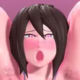
Added 2024-12-13 17:19:11 +0000 UTCPreview of the studies and posters in the "other" folder or Discord server! :D
First Update Post!
I should’ve started these updates earlier, but I get super easily distracted when writing long posts, LOL. Anyway, here we go! I'll be making a series of posts to keep you updated on everything I’m learning. At first, I wanted to compile everything into one post, but there’s just way too much to cover. Hopefully, these updates will keep you entertained along the way, :D
Let’s dive into lighting and composition studies!
Okay, hear me out, I’m not obsessed with Overwatch, I promise I’ve done studies with other games too, D:
This month, one of my main goals was to refine a consistent workflow and setup for lighting and composition. I wanted to create a process that would not only speed up my work but also make it way less frustrating. Before this, every new project started with me placing lights intuitively, just messing around to see what worked. This trial-and-error approach often led to hours of effort, sometimes resulting in compositions that didn’t quite hit the mark. To fix this, I compiled lighting techniques that worked well in the past and reviewed my favourite animations and posters I did to build a better workflow for my scenes.
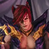
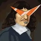
Example #1: Baptiste & Ashe
The Baptiste poster was my first study. As always, I started by visualizing the scene in my mind and began building it. My goal was to create a dramatic setup, Ashe in the foreground, being scolded by Baptiste, the "overly good moral guy"” I aimed for a cinematic feel with strong contrasts, volumetric lighting, and a tilted camera angle, but it just didn’t work. The setup wasn’t appealing, and no matter what I adjusted, something always felt off.
After thinking it over, I decided to scrap the entire lighting setup and start fresh with a simpler, cleaner approach. My focus shifted from trying to make something “cool” to creating something solid, a good foundation I could build on.
The Base of My Lighting Setup:
I put together a note file with key steps for my lighting process,
1 - Large Fill Light: A soft light, usually from above, with higher glossy influence than diffuse. This gently illuminates the focal points in the scene.
2 - Main Spotlight: A small spotlight (size 0 or 0.05) that highlights the scene’s focus. Its sharp shadows and high contrast draw attention to the subject.
3 - Large Point Light: A big point light (shadowless) used to eliminate unwanted shadows. Its size matches the character or object in focus, and its intensity helps refine shadow control.
4 - Enhancements: Depending on the scene, I’ll incorporate elements like gobos, rim lights, and bloom effects to add polish.
One of my biggest priorities is managing shadows effectively. Cycles handles light bouncing much better than EEVEE, even with ray tracing enabled. In EEVEE, light often refuses to bounce in certain areas, creating unrealistic, harsh shadows. My setup focuses on removing those unwanted shadows with soft lights, then layering more intense spotlights to craft dynamic, intentional shading.
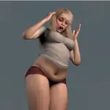
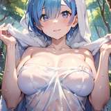
Example #2 - Ana Model Showcase and Example #3 - D.Va and Car Driver
The D.Va poster was one of the first pieces I created this month. After studying Baptiste's and Ana's posters, I reworked it to improve several aspects. The lighting is now much more consistent in intensity, with a combination of fill lights and spotlights creating a sharper and cleaner image. The colors are more vibrant, and overexposed areas have been eliminated. It's essential not to push the light intensity too high in Blender, this reduces control during post-editing and increases the risk of overexposing illuminated areas.
As for Ana, as always, the process began with visualizing the scene. In my old workflow, I would often start by placing the primary light source, usually a spotlight on the scene's focal point and then build the rest around it. This approach resulted in unrealistic, soft shadows that gave the scene a plastic-like appearance. To improve, I experimented with smaller lights to create sharper shadows and stronger contrasts, but this still left some shadows too dark, as they lacked the natural bounce of light.
In the latest iteration, finalized just before reworking the D.Va poster, I applied my updated lighting techniques. By mixing fill lights with high-contrast lighting, I achieved a scene that looks sharp, clean, and evenly lit without overexposing any areas. The result is something I’m really happy of! :D
End of the update!
Aaaand that's it! I planned to write about more progresses but the post is already very long so I'll write about them in another post in the next days :D
Comments
Aww thank you!! :D Truky appreciate it :3
ZMSFM
2024-12-15 07:07:26 +0000 UTCMany like me are just reading but not commenting, but now i do, so you know you have us lurking in the shadows !
Sl1xx
2024-12-14 23:38:33 +0000 UTCThank you for the info! Have a great weekend!
Dave Ort
2024-12-13 21:08:42 +0000 UTC