Image Gallery
Added 2022-06-22 19:05:08 +0000 UTCHey folks! Please read before you vote!
One of the things I'm wanting to do with this housekeeping update is make some changes to the image gallery, but I'm having some trouble. Design stuff isn't my forte at all, so I'm looking to get some opinions and ideas!
Are there any games out there that have galleries you like due to how it looks and ease of use? Can you share examples if so? Please keep in mind that mine does tend to function a littler differently than most due to the variety of outfits my characters have (and that I can mix and match outfits too!). Heck, even if you don't have an example but have some other idea in your head, doodle it out and share! You never know what kind of ideas you could spur.
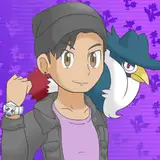
With Dwayne not having his own, I've decided to use setting up his gallery as a way to figure out how I want to handle things so I can update everyone else's in the future. I want to remove the multiple tabs bit (beyond having one for characters), and just keep everything to a single page.
Do people like this setup? It's pretty basic, but I feel like it probably works the best. I find navigating multiple tabs just to be clunky now. I thought it was neat when I did it, but now... not so much.

The background is something I plan on keeping, but as the player progresses through the route, the background for a character can change depending on certain conditions being me. I can continue with that idea or just use a static background meant for only the gallery as well.
Once I have a layout, I'll be working with CaptainGerBear to at least make it look nicer than it does currently with some nicer boxes and whatnot!
And as an extra note, I'll be using similar ideas to translate over to the music gallery too!
Thanks for your input, folks~
Comments
Gotcha! Thanks for the input~
DyneWulf
2022-06-25 21:04:21 +0000 UTCI also agree with Mestev, I feel that would be a good gallery template.
Frosted Fir
2022-06-23 10:45:46 +0000 UTCOk while I think a simplified and organized galley would be good but stuff should be separated at times as well. If I had to pick a gallery that works and also deals with characters with different outfits is Sileo: Tales of a New Dawn.
Mestev
2022-06-23 05:39:32 +0000 UTCWhat's confusing about it beyond it not working?
DyneWulf
2022-06-23 05:30:33 +0000 UTCThe gallery is confusing and it often crashes for me when I try exploring. So any simplifications, I welcome.
Vernedi
2022-06-23 04:57:41 +0000 UTCGood!
Azaghal
2022-06-23 04:09:04 +0000 UTCDyne will remember this.
DyneWulf
2022-06-23 02:22:09 +0000 UTCYour gallery is bad and you should feel bad!
Azaghal
2022-06-23 01:05:59 +0000 UTCI think you can change the grid layout by just increasing the margins, and those can be for scenes. The rest, I’m not too sure because I hardly know about game design
HumanCoffee
2022-06-23 00:53:48 +0000 UTCI'll have to consider stuff for small screens for sure. It wasn't something I was thinking about originally. I might have to set up different galleries to be dependent on the device. I like the idea about the missing items too! I have a couple of ideas there, but I'll have to mess with it to see what I can do.
DyneWulf
2022-06-22 22:31:51 +0000 UTCI certainly want to clean things up! Making things easier to look at it a big + for me.
DyneWulf
2022-06-22 22:30:30 +0000 UTCA more elegant UI -would- be nice! I just... am bad at programming and don't know what all I could do that, hah. It's something to think about though! (I also agree about Dwayne)
DyneWulf
2022-06-22 22:17:31 +0000 UTCYou bring up a good point! And I totally forgot about adding faces into it too... I'll have to keep that in mind!
DyneWulf
2022-06-22 22:16:11 +0000 UTCI personally like the current layout but if it makes it easier to manage the programming and less glitchy than a simpler one would be better. One question is, does one grid of 12x11 have enough fields for all outfits, CG, poses, expressions etc. of a single character? a bigger grid would make it harder for Mobile players. So it depends on the size of the content for the gallery.
Hikaru Ginno
2022-06-22 22:02:44 +0000 UTCI think so. Plus it also would help for the other characters as well. I always had trouble viewing the images for characters that aren't one of the main ones (ex: Maria, Bam, etc). But if each character had its own tab and all their images were on that tab without having to shift between them, it would make it easier to view them as well.
Bobby Thornbody
2022-06-22 20:13:19 +0000 UTCThe simpler one might be more effective than the current one, since it can accommodate side characters. Thought it would be pretty nice to have a more elegant UI (though I know it's not as important as the main content). Drop down menus for the clothes would be pretty neat, categorized by outfits and pieces. It would be nice to give scenes their own menu layout, since I think it would be better to make the icons for them larger to understand the context of it. Also, Dwayne is a sweet boi deserving of many bananas
HumanCoffee
2022-06-22 20:06:04 +0000 UTCThank you for the input! From my understanding, my gallery is pretty unique with how it's handled, so sticking with this kind of formula might just be for the best.
DyneWulf
2022-06-22 20:00:13 +0000 UTCI personally like the tabs of different clothes so it’s easy to see what’s what on smaller screens. Also, I think it might be helpful to have missing items tell you what day they are found on so you know if you need to go back and pick a different option to see a certain outfit/clothing item. With a game with so many choices, I feel like knowing what was missed is like finding a needle in a haystack
Nick
2022-06-22 19:57:26 +0000 UTCHahaha, yes, things working as intended is much preferred!
DyneWulf
2022-06-22 19:57:11 +0000 UTCI like the simplified version you gave as an example. You can still see all the clothing choices and the event images below it. Just removing the tabs seemed to really clear up the screen. I think removing the tabs to clean things up, like the Dwayne example, is a good move.
Morphbeast
2022-06-22 19:27:09 +0000 UTCMaking them all look more like Dwayne's example is a good idea. Personally, yours has been the best gallery set-up I've seen, and simplifying it would also make it less frustrating to navigate. The different tabs for each character are good, but separating the categories out within each of them always seemed to lead to issues switching between characters for me. So yeah, keeping the same layout, but simplifying them so each character just has a single tab would be a good idea, in my opinion.
Bobby Thornbody
2022-06-22 19:12:08 +0000 UTCI said simplify like Dwayne's cause allot of the gallery is glitchy and if you simplify this it would make it easier to fix that glitches too. Also a tab for secondary characters would work too.
Flashlion
2022-06-22 19:10:34 +0000 UTC