Alright folks! let's begin ^^
My initial idea for this series was very specific, I wanted to pair a Goth femboy with a very girly girl:

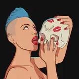
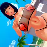
these characters would meet in a "boteco" (Brazilian bar) and things would go from there, the idea is to play with the contrast between the two characters and explore some of the casual urban settings of life in Brasil:

However, after the first two pictures were done I realized 3 things; the first one is that I didn't feel like I had nailed down the femboy character design yet, his facial features, body type and overall vibe didn't feel consistent, and I need a few more iterations until I get his personality right:

The second one is that I have too many ideas for this couple 😅 I have a pretty clear vision of what I want for them, and what "slices" of their life/relationship I want to show, and for that I will need more time to develop them, and let things mature a bit more in my head.
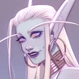
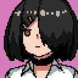
The final reason is that I just had too many Goth Femboys living in my head haha 😅I had a few styles and designs that I wanted to get out, and focusing only on these two would feel limiting right now, and this is why we got 4 Goth Boys instead of one ^^

The way I decided to tackle these other Goth Boys was to get inspiration from the goth style from 3 different decades, 80s, 90s and 00s.
For the 80s boy my inspirations were mainly from the gothic-rock / Post-punk aesthetics, in particular the band "The Cure", and also the character Pris from the Movie Blade Runner (82).

For the 90s Goth Boy My inspiration was mainly the movie The Craft, in particular the character Nancy Downs (Fairuza Balk), to be honest

I didn't need much more inspiration than that cause the overall style of the movie and its characters perfectly capture the vibe of 90s goth imo, but here are a few other random inspirations for the character design:

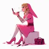
For the 2000s Goth Boy one of the main inspirations was the singer Amy Lee from the band Evanescence, but to be honest, the whole "mall goth" style of the 00s is still pretty popular today, so it wasn't hard to find a lot of different references for this one, here's a few:
As for the art style, my main goal was to keep things simple and focus on character and shape design, bold clear silhouettes that are simple and easy to read, and leaving colors for last, just a way to bring that extra spark and tie everything together.
As you can see here, the very first rough sketch already has all the major shapes and silhouettes established, and when adding the values I made sure to keep these shapes clear and readable, note that the addition of the the dark gray value (hair and top) served to create more contrast in the face area, and by doing so, bring attention to it, but still, it maintained the bigger silhouettes unbroken and easy to read, same with the light gray used on the background, it made the subject pop up and his silhouette even easier to understand.

You will notice that I didn't fill the area of his pants with a darker value even tho the pants' material is dark, the reason for that is, If I made his pants darker, be it black as the hair, or light gray as the background, they would create too much contrast on the lower half of the image, pulling away attention from the top half, where the character face is. While his pants are an important aspect of the character design, you don't need a lot of information to understand that it is a baggy pants and is prob dark, just the strong shapes of the pants already tell you all the information you need about it, so what I would gain by adding another value to it would not be worth the amount of attention it would pull away from his face.
We must always remember that composition is all about contrast, and when it comes to contrast, for it to be effective, something always has to lose so something can win, in this case, the pants "lose" so that the face could "win".
Now for the colors.

As I mentioned before, the colors here are very simple, I started by adding some base colors using a couple of Gradient Maps, these are more "mood" colors and not really descriptive of any material, I just made sure to keep the darker values cold using some blues and purples, and the light values warm, using some pinks and yellows.
Once I was happy with the base color the first thing to do is to add in some warm colors to the skin areas, it is important to get this right early because by making the skin "feel" like skin, our eyes will forgive most of the other "color abstractions", the only reason why I can use that "nonsensical" purple and yellow on the background is because the character's skin look and feel like skin, it servers as a "anchor to reality" and keep things somewhat grounded, leaving us free to explore other color combinations based purely on aesthetics, and not really on the actual base color of any object.
And that's pretty much it, hope this breakdown was an interesting read.
thanks a lot for your support and patience my friends ^^
Cheers!
The sabu
2024-09-05 18:44:02 +0000 UTCThe sabu
2024-09-05 18:38:24 +0000 UTCMUPLUR
2024-09-05 16:57:48 +0000 UTCShae Guerin
2024-09-03 15:20:52 +0000 UTCThe sabu
2024-09-03 02:19:45 +0000 UTCAnton
2024-09-03 01:22:57 +0000 UTCThe sabu
2024-09-02 22:41:46 +0000 UTCKozark
2024-09-02 21:52:31 +0000 UTC