Let’s have a look at the last of Chris’s images.
IMAGE FOUR

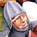
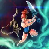
I like this piece, the pose is nice and I think you communicate the emotion, but I also really feel that there is an excessive amount of hatching, and the line weights of the hatching feel very inconsistent which makes it feel needlessly busy. As with the previous pieces, I feel that a simpler approach would be stronger - hatching is fine but I think a lot of it could be replaced by more solid shapes. I would raise the helmet up a bit, and move the glove over so there is more negative space surrounding it, again so that the silhouette is much clearer and we don’t lose that leg and foot. I’d also reduce the detail on the sword blade to make it stand out against the black surrounding it.

I’d also make sure there’s some negative space between his arm and his body, again for - you guessed it! - a clearer silhouette.

IMAGE FIVE

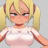
This one is my favorite of the five, mainly because it’s the most striking and the gun pointed at us is immediately engaging. Great foreshortening on the arms too - I’ve seen this pose often executed very poorly, but I think it works here! But there’s still some of the same issues plaguing it. The background is filled with a lot of thin, fiddly detail that is really not necessary and really flattens everything out. I would simplify all of that thin cloud detail, one or two lines describing the clouds is all that’s necessary. The palm trees are really excessively rendered - drawing all of the individual fronds is wasted time, and her hair overlapping them with the same level of detail really confuses. I would drop the tops of the trees into graphic silhouette, it’s easier and faster to draw and still has the same effect. The distant background I would put in silhouette also, and use the black to contrast the shapes of the crashing waves and beach. I am assuming that is a motorboat crashed on shore - but I will be honest, it took me a minute to figure that out, there isn’t enough structural detail or solidity to it to make it immediately clear. As it’s on fire, I would define the flames by the thick black smoke that’s produced by a burning gasoline engine, and give a heavier shadow to the underside of it to help indicate its size and mass. I’d also add some shadow to the inside of her shirt to help define the shape of her side (and the bikini strings) and under her jaw to simplify that area. Finally, I don’t think that looks like a real gun - I think it more resembles an Airsoft gun or something - you would be better served to reference a real one for maximum impact.

And that’s it! Thanks so much Chris for submitting your work, and I hope that you found this helpful!
Cameron S
2023-05-15 07:07:13 +0000 UTCSketch Aesthetics
2023-05-15 07:00:10 +0000 UTCCameron S
2023-05-14 14:01:55 +0000 UTCSketch Aesthetics
2023-05-14 14:00:59 +0000 UTC