On Lettering
Added 2025-06-09 10:26:07 +0000 UTCOnce of the things that I dislike about modern comics, especially the ones made by a team, is digital lettering that just feels placed on top of the artwork, floating above it rather than integrated into the drawings. This goes double for sound effect lettering - mechanical, precise letters made in Adobe Illustrator feels just as egregious to me as seeing very obvious CGI in a movie. I’ve used digital lettering in the past, and a lot of my published work has been digitally lettered by others, but I love lettering that feels organic and drawn by the same hand that did the artwork. (This isn’t to denigrate the work done by professional letterers, it’s a skill and an art like any other, this is just my personal taste).
When it came time to work on O&O I made the decision that I wanted to do hand-drawn lettering that was directly on the boards, because this is the first comic I’ve drawn in ink on paper in probably 15 years, and I wanted the physical pages to feel “complete.”
I do my “pencils” digitally before printing them off on paper to ink and so I wanted to take the same approach for the letters.
I started by making a template based on an “Ames guide” (a tool for drawing guidelines for lettering to keep height and spacing consistent) as a layer that I could move around on the page below the artwork, to letter over.


The benefit of doing this stage digitally is that I could tweak the lettering until it was correct, I would digitally move and resize certain letters if they were wrong, edit dialogue to fit into the balloons properly, etc, so that when it came time to ink I knew everything was where it should be.
Then I inked the entire page, letters and all.

I was quite happy doing this, it was meditative and it all felt properly integrated.
The problem is that it took fucking forever. This page, the first with dialogue and quite a lot of it, took me the better part of 2 days to finish, in part because I was trying to ink the lettering very carefully and precisely to keep legibility - something I have noticed whenever I handwrite a letter, or in a journal, is that my lettering begins very careful and precise but as it continues down the page it gets sloppier and more haphazard as I relax. So I was trying to ink the lettering slowly, with even more care than the drawings, which just ate up a tremendous amount of time.
The second problem was that when I scanned the final inked page at high resolution (I always scan at 600dpi), I thought that the lettering, while aesthetically consistent, was still a bit too “fuzzy” for my liking. The drawings can get away with some fuzziness but I felt like it was hampering legibility a little in the letters.
So, what to do now? I decided that maybe the most important thing was keeping up efficiency, because these pages already take me long enough. Digital lettering was looking more appealing…
I decided that the compromise was to make a font based on my hand lettering. I used a web app called calligraphr which specializes in making hand-lettered fonts. You download a template and write out your full alphabet, numbers, punctuation, etc, and it will scan it and compile it into a font.
But - even though it is based on hand-drawn letters, one thing that really gives a digital font away is that all the letters look identical, something I didn’t want. So here’s the trick - Calligraphr allows you to make alternate versions of each letter by redoing the templates and compiling the alternates into the final font. It will then randomly include the different versions to give it a more organic feeling.
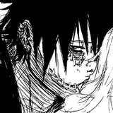
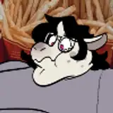
But here’s the real trick - instead of doing one set of alternate letters, which is what most people would do, I did seven. (There’s no reason for that number in particular over six or eight, it just felt like a good number of alternate sets, and not as tedious as doing as many as ten). So now, the font randomly chooses each letter from a variety of alternates, which on casual inspection gives it the appearance of being totally organic. The central text in the below image is the digital font, the surrounding letters are hand done, and I think it is similar enough to not be immediately noticeable.

But now the next problem - I really wanted to have the lettering directly on the boards, instead of having blank balloons. I tried printing out the page with the artwork in my usual faint grey to ink over, and the digital lettering in solid black, but the paper I ink on isn’t capable of having very crisp lines, there’s some ink bleed, so I was again faced with fuzzy lettering.
So my insane experimental solution: I printed the letters separately on high quality photo paper and pasted them onto the artboard.


This is an old-school way of doing it that gives the original art boards a really interesting hand-made quality, but also took almost as long as inking it all by hand. And also, it’s just fucking insane. Am I gonna do this on every page??
I finally arrived at the (imperfect) solution: I print the letters out on the boards in black, and ink around them, and that’s fine for the original boards, but for legibility and eventual print purposes, I re-insert the digital font lettering when I scan the artboard and do the digital tones. I’m still searching for the perfect method that will balance everything but this is the method that works best for me for now.
Hand lettering (top) vs digital font comparison:


And now you know why I can be so slow with these pages!!
Comments
This effort, and your documenting of it, is really appreciated, thank you! Walking this line between making something personal as a solo creator, in an authentically human way and getting shit done is obviously something you're putting a lot of thought into. Post-AI this feels more important than ever. And just so you know, from our perspective, as comics consumers, the tension is also palatable - make the sensible trade-offs, do what you need to, we're rooting for you, keep going! 😁
Charlie August Chan
2025-06-11 08:15:42 +0000 UTCI have been using a Pilot Falcon fountain pen but recently also started using UNIPin fineliners, which I like because there’s much less chance of smudging the ink!
Cameron S
2025-06-09 12:31:55 +0000 UTCI 100% relate to this struggle. I “hand letter” my comic digitally in procreate currently but have tried traditional too. I agree that it’s so much more interesting when it feels like the text style matches the artist’s hand and by contrast looks glaringly out of place when digital lettering isn’t done well (something I’ve also been guilty of). Thanks for the recommend on Calligraphr, I think you’ve mentioned this before but can you recommend what inking pens you use? Great work as always.
Dan Dougherty
2025-06-09 11:35:17 +0000 UTC