


уБУуВУуБ░уВУуБпцаЮуБзуБЩуАБ
чЫ┤хЙНуБоцКХчи┐уБлуБкуБгуБжуБЧуБ╛уБДчФ│уБЧши│уБВуВКуБ╛уБЫуВУуАВ
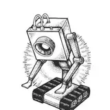
чкБчД╢уБзуБЩуБМуАБчзБуБпуВдуГйуВ╣уГИуБоуАМхоЯчФицАзуАНуБлуБпуАБуАМуГРуГГуВпуГЬуГ╝уГ│уБМуБВуВЛуБЛуБйуБЖуБЛуАНуБМуБКуБКуБНуБПхпДф╕ОуБЧуБжуБДуВЛуБишАГуБИуБжуБДуБ╛уБЩуАВ
уБЭуБоф║║чЙйуБМуБйуБЖуБДуБЖшАГуБИуВТцМБуБгуБжуБДуБжуАБуБйуБЖуБДуБЖчФЯц┤╗ч┐ТцЕгуВТщАБуБгуБжуБДуВЛуБЛуАВ
шжЛуБжуБПуВМф╕жуБ┐уБлщЗНшжБуБкшжБч┤ауБауБицАЭуБгуБжуБ╛уБЩуАВ
уБауБгуБжхдкуБгуБжуВВчЙ╣уБлц░ЧуБлуБЧуБжуБкуБДхнРуВИуВКцБеуБШуВЙуБгуБжуВЛхнРуБоцЦ╣уБМуВДуБгуБ▒уВКуВиуГнуВдуБШуВГуБкуБДуБзуБЩуБЛуАВ
уБЭуБЧуБжуАБуВнуГгуГйуГЗуВ╢уВдуГ│уБлуБпуБЭуБоуГРуГГуВпуГЬуГ╝уГ│уБМхдзуБНуБПщЦвуВПуБгуБжуБНуБ╛уБЩуАВуБиуБДуБЖуВИуВКуАБуГРуГГуВпуГЬуГ╝уГ│уБЛуВЙуБЧуБЛчФЯуБ╛уВМуБкуБДуБишиАуБгуБжуВВуБДуБДуВИуБЖуБкц░ЧуБМуБЧуБ╛уБЩуАВ
хНШч┤ФуБкф╛ЛуВТцМЩуБТуВЛуБиуАБц┤╗чЩ║уБкуБоуВТшбичП╛уБЩуВЛуБЯуВБуБлчЯнщлкуБлуБЧуБЯуВКуАБщАЖуБлуБКуБЧуБиуВДуБЛуБкхнРуБпщХ╖щлкуБлуБЧуБЯуВКуАВхЖЕщЭвуБМуБкуБлуВВц▒║уБ╛уБгуБжуБДуБкуБДуБЖуБбуБлхдЦшжЛуВТц▒║уБ╛уВЛуБоуБпуБ╗уБиуВУуБйф╕НхПпшГ╜уБкуВУуБШуВГуБкуБДуБЛуБкуАБуБиуБЩуВЙцАЭуБДуБ╛уБЩуАВ
щХ╖уАЕуБиф╜ХуБМшиАуБгуБжуБДуВЛуБоуБЛуБиуБДуБЖуБиуАБцЩВщЦУуБоуБЛуБЛуБгуБЯшиАуБДши│уБзуБЩуАВхоЯчФицАзуВТцМЩуБТуВИуБЖуБицАЭуБЖуБиуБйуБЖуБЧуБжуВВцЩВщЦУуБМуБЛуБЛуБгуБжуБЧуБ╛уБДуБ╛уБЧуБЯуАВ
ф╗КцЬИх╛МхНКуБпуБУуБЖуБДуБЖхнРуВТцППуБДуБжуБ╛уБЧуБЯтЖУ
уААтЩжтЩжтЩж
ца╣уБгуБЛуВЙуБочФШуБДуВВуБохе╜уБНуБзуАБчЙ╣уБлуГЙуГ╝уГКуГДуБлуБпчЫоуБМуБкуБДх╜╝хе│уАВ
уБДуБПуВЙщгЯуБ╣уБжуВВхдкуВЙуБкуБДуБоуБМхпЖуБЛуБкшЗкцЕвуБзуАБх░ЖцЭеуБохдвуБпшЗкхИЖуБох║ЧуВТцМБуБгуБжуГЙуГ╝уГКуГДф╜ЬуВКуВТце╡уВБуВЛуБУуБиуБауБгуБЯуАВ
уБЧуБЛуБЧуАБуБДуБЦщЦЛх║ЧуБЩуВЛуБиуВНуБПуБлхг▓уВМуБкуБДцЧеуВВхдЪуБПуАБх╗ГцгДуВТц╕ЫуВЙуБЩуБЯуВБуБлшЗкхИЖуБзц╢Иш▓╗уБЧуАБ чй║уБДуБжуБДуВЛцЩВщЦУуВТцЦ░ф╜ЬуБощЦЛчЩ║уГ╗шйжщгЯуБлуБВуБжуВЛцпОцЧеуБауБгуБЯуАВ
щАЪх╕╕уБоц╢Иш▓╗уВТуБпуВЛуБЛуБлф╕КхЫЮуВЛуВлуГнуГкуГ╝уБич│ЦхИЖуГ╗шДВш│куБоцСВхПЦуВД20ф╗гуВВхНКуБ░уБлхЕеуБгуБЯуБУуБиуБзх╛УцЭеуБоф╗гшмЭуБоф╜Оф╕ЛуВВуБВуВПуБХуВКуАБх╜╝хе│уБпуБ╡уБишЗкхИЖуБош║лф╜УуБохдЙхМЦуБлц░ЧуБеуБПуАВ
уВ╣уВлуГ╝уГИуБоуГкуГЬуГ│уБМф╗ехЙНуВИуВКчЯнуБДуАВщбФуВВуБУуБУуВНуБкуБЧуБЛф╕╕уБПуБкуБгуБЯц░ЧуБМуБЩуВЛтАж
уБЭуВМуБзуВВхдкуВЙуБкуБДф╜Уш│куБауБЛуВЙуБЭуБоуБЖуБбчЧйуБЫуБжуБДуБПуБауВНуБЖуБишжЛуБжшжЛуБмуБ╡уВКч╢ЪуБСуБЯч╡РцЮЬуАБх╜╝хе│уБоф╜УщЗНуБпхвЧхКауВТуБдуБеуБСуАБуБдуБДуБлхИ╢цЬНуБМхЕеуВЙуБкуБПуБкуБгуБжуБЧуБ╛уБЖуАВ
уААтЩжтЩжтЩж
тАжуБ┐уБЯуБДуБкуАВ
хдкуВЙуБкуБДф╜Уш│куБауБгуБЯхнРуБМц▓╣цЦнуБЧуБжхдкуБгуБжуБДуБПуБоуАБуБДуБДуБзуБЩуВИуБнтАж
уГЙуГ╝уГКуГДх▒ЛуБХуВУуБгуБ╜уБПшжЛуБИуБ╛уБЩуБЛуБня╝Я
ц░┤чЭАуБоуГХуВйуГ╝уГЯуГАуГЦуГля╝ИуВвуВ║уГмуГ│я╝Йя╝ЛуГЦуГмуГГуГЗуВгя╝ИNIKKEя╝Й
уБ┐уБЯуБДуБкуГЗуВ╢уВдуГ│уБлуБЧуБжуБ┐уБ╛уБЧуБЯуАВ
уВВуБгуБиуГйуГХуБкцДЯуБШуБоч╡╡уВТщЗПчФгуБЧуБжуБДуБНуБЯуБДуБицАЭуБгуБжуБДуВЛуВУуБзуБЩуБМуАБуБ╛уБащЫгуБЧуБДуБзуБЩуАВуАВуАВ
ц░Чф╗ШуБСуБ░хРМуБШхз┐хЛвуБзуБЧуБЯуАВ
уВВуБгуБиуГйуГХуБлуБДуБНуБЯуБДуАВцЬмх╜УуБпуАВцЭех╣┤цФ╣хЦДуБЧуБжуБДуБНуБЯуБДуГЭуВдуГ│уГИуБзуБЩуАВ
ф╗Кх╣┤уБпф╜ХуВВуБзуБНуБЪчФ│уБЧши│уБВуВКуБ╛уБЫуВУуБзуБЧуБЯуАВ
цЭех╣┤уБУуБЭщаСх╝╡уВКуБ╛уБЩуБоуБзуБйуБЖуБЮуВИуВНуБЧуБПуБКщбШуБДуБЧуБ╛уБЩуАВ
уБкуБлуБЛхоЪщЗПчЪДуБкчЫоциЩуБМхЗ║уБЫуВМуБ░уБДуБДуВУуБзуБЩуБМтАж
хд▒ш╕куБЧуБкуБДуБЯуВБуБлуВВцЬАф╜О1цЧе1уГЭуВ╣уГИуБпуБЧуБжуБДуБНуБ╛уБЩуАВ
imanoterone
2026-01-04 09:54:59 +0000 UTCimanoterone
2026-01-04 09:52:29 +0000 UTCцаЮ
2026-01-04 08:15:32 +0000 UTCimanoterone
2026-01-03 06:29:57 +0000 UTC


