Commentary: Page 9-10
Added 2024-06-27 12:29:53 +0000 UTCQuick note: instead posting 4 pages worth of commentary every month, we've decided to post 2 pages worth of commentary every 2 weeks. It's the same amount in total, just posted more frequently!
Page 009 - Isle of You
I felt it was important to introduce the remaining three anime girls on this page, just to get everyone introduced and settled. It’s a lot of characters to throw at the readers at once, admittedly! But they don’t really need to remember who’s who at this point. The anime girls at this juncture in the story are basically a wide interchangeable mass of Girl that inflicts pressure on Jiro. All the readers really need to know about them yet is they exist, and once they start distinguishing themselves it’ll be a gradual process that readers will only really need to acquaint themselves with one or two at a given time.
I was partly inspired here by Shawshank Redemption, a noted good movie, which I noticed never really took a moment to distinguish the various inmate characters to the audience. There’s no establishing character moment for each of the boys, they’re just introduced collectively as Red’s friends, and they show their personalities to the viewer as you watch. By the end you might not even remember which one was Haywood, but that doesn’t really impede your ability to enjoy the movie, does it?
Let’s get into the designs of the three introduced here.

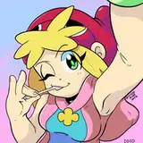
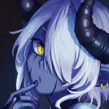
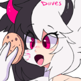
Zabelle is a witch! With jagged hair to reflect her Element of lightning. I kinda whipped up her design in a hurry, I didn’t have a concrete idea of how she’d look before this page but I had to come up with something. This chibified sprite look was actually the first time I’d ever drawn this iteration of this character, and at this time I didn’t even really know what she’d look like in the usual art style! It took me awhile to figure that part out. The basics remained – boots, loose sleeves, and a big ol witch hat – but exactly how those elements should be proportioned, that took some time. I’ll talk more about my decisions there later.
Peri’s Thoughts:
I just want to state for the record that drawing Zabelle's hat is one of the things Lum gripes about most consistently in the entire comic. I don't blame 'em, fitting hats on heads suuuuucks.


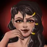
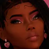
Casandra is the local shopkeep. She’s comparatively wiry compared to the other girls, not a great deal in the way of hips or bustline. I think it’s a look that fits her gremlin nature. Her outfit is very summery, with the shorts sandals and tube top. Lose the apron and she wouldn’t look out of place on Bondi Beach. Summer clothes is an idiom I find works very well with the aesthetics of Love Bomb. It reinforces the idea this is a tropical paradise, and it gives an in-universe justification for why so many of them show so much skin. Cas’ outfit specifically was actually proposed for Helen at first! That’s where I started with the idea of combining that light summery outfit with a big apron, it was loosely conceived of as a PG version of that “Naked Apron” thing that cheesecake anime loves so much. That would be a funny thing for a blacksmith to wear, I thought, protecting the chest but with bare arms legs face and neck. In the end I went with basically the opposite look for Helen at Rhys’ suggestion, where she’s protected everything else.
Back to Cas though.
I transferred the apron and summerwear look to her because I was enamoured with it already and didn’t really have anything for her anyway, but after that her design still felt like it was missing something. So, the jewellery. It helps to make her feel a little more materialist than her peers, and I like to think the big stupid coin around her neck is some kind of good luck charm. It’s also, critically, a very Japanese style of coin with the square cut out of the middle. Love Bomb is aesthetically based on Japanese interpretations of European fantasy, and I always find interesting how those works often include Japanese cultural references mixed seamlessly in with the very Euro castles and swords, like how everything the Dungeon Meshi guys cook up seems to be some kind of modern Japanese cuisine. There’s a kind of cosmic punchline here, of course, which is that Love Bomb is filtered another layer down: it’s a Westerner’s view of a Japanese view of Western Fantasy. I wonder how Love Bomb would come across to a Japanese reader… would they find it quaint? …offensive?
(Also: her hair looks like a moneybag and her little hairtuft out front looks like a roll of cash, since her Element is money)
Peri’s Thoughts:
Ah Casandra! She is definitely one of the most fun members of the Love Bomb cast, mostly because of her deep commitment to being a little bit terrible in the name of capitalism and personal greed! We stan a problematic queen. Her dialogue was probably the aspect that received the most editing attention on this page, since it took some experimenting to get her voice right. Lum was going for “laid back cool girl, maybe a little punk”, but I remember sending back the first version of this page with notes calling her a “discount cowgirl” due to the profusion of “ain’t”s and abbreviations of “‘-ing” into “-in’”. (Sorry Cas… ^^;) Keeping track of character voice is one of my regular jobs as an editor (you might be surprised how much work goes into figuring out whether characters say “ah” vs. “oh”, “oh oh!”, “ahaa”, “ummm”, “hehe” vs. “ahaha”, etc), and the first time a character shows up there’s often a good amount of back and forth as Lum and I figure out what they are going to sound like on the page. Since ForEach is so text-forward and dialogue-heavy, it’s important for the character voices to be clear, distinctive, and consistent. Casandra ends up having a more laid back way of speaking, a little flirty and a little combative, and she uses more vocal shortcuts (including the occasional “ain’t” or double negative) to make it seem like she’s speaking off the cuff. I think it works well!
Oh and that shop list she’s displaying? My favorite easter egg on there is the Tome of Orbs, which we slotted in there as a joke as Lum was drawing the page. At the time, orb-pondering was a big meme and we all got a laugh out of it… and it works as great foreshadowing for Casandra’s new business venture in Chapter 2… >:)

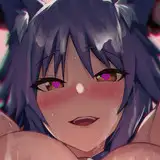
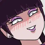
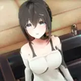
Eladea is an acolyte for the Love Goddess, kind of a representative of how the religion functions on this island. Rhys came up with her design actually, I should really ask him about it... I recall she's meant to look like a cleric, with that tall hat. All good religious institutions come with a big hat. I will also add that her hair used to be a very pale cyan, but I was worried about readability in the lovebomb textboxes to have a character with hair that light. You know, like:

In hindsight, it would have been fine. But at the time I was working out the anime girls’ colours I hadn’t yet finalised the look and feel of the shadows around the text yet, so I wasn’t sure about the limitations at play here.
Peri’s Thoughts:
For the record, I’m a MUCH bigger fan of royal blue Eladea than pale blue Eladea. The pale feels too similar to Jasper and the Goddess’ colors, and it would have singled her out as the only pastel color among the other Love Bomb jewel tones. I like her being blue, but a different blue from the Goddess–after all, Eladea is her acolyte, but she’s got her own separate powers
Other aspects that Lum didn’t point out–her dress looks like a fish! The skirt is the tail and the neckline forms the mouth. I think it’s kinda brilliant (Rhys is a real wizard at designs, y’all.) Add in seashell on the hat, and you have the Goddess’ most devoted follower being strongly ocean-themed–which is a nice bit of foreshadowing about what the Love Goddess’ other domain is before it gets revealed in Chapter 2.
I like this tutorial bit here:

It’s funny to think that this fake, in-universe tutorial is also functioning as a real actual tutorial for the readers of the webcomic. I considered having narration in Foreach at some point, much like Homestuck, but decided against it because it didn’t feel very Videogames and I’m not very confident in my prose. In a lot of ways though videogame UI elements like these act as their own kind of narrator, chiming in with additional information whenever I feel I need to exposit something that no character has a real reason to explain. And it comes with the added bonus that it feels like a clever use of the premise to insert these elements. Frankly, cramming in things that make you go “ohhh clever” is like half of Foreach’s artistic intention lmao.
Peri’s Thoughts:
On this page we get our first shot of Hollidae Island! It looks very idyllic, doesn't it? I’m not sure if Lum has ever told me the exact inspiration for the island, but my impression is that they just kinda… drew something that looked nice! And then ended up retrofitting map elements to it after the fact. The temple, Zabelle’s portal, and the town square were all pretty clear from the start, but I’m not sure if it was ever the plan for the lone house to be Jiro’s or not. And the stand of trees at the base of the volcano being where Coral’s portal door is hidden at the end of Chapter 2–I’m pretty sure that one was a complete retrofit. Same with the location of the cove where Hellfuck’s glitch door is hidden in Chapter 3–I’m pretty sure that’s in the cliffs to the bottom right of the Temple. Probably? It doesn’t matter hugely, but it is interesting to me how Lum returned to off the cuff decisions and milked them for more details later.
(Lum’s counternotes: So, the isolated hut was absolutely meant to be Jiro’s. We hadn’t yet decided that the hellfuck glitchdoor was in a cove at this point, or even that it would be a door and not, I was still playing with an idea where it’d be an immaterial passageway hidden beneath the waves. The palm trees was absolutely a retrofit as Peri called out here. At the end of Chapter 2 I actually retconned in a belltower into these outside views, because I wanted there to be a belltower. For important reasons I’ll get to later.)
This is also the page where Lum started using placeholder text for the images! Early on, they would write the page and send it to me for editing with dialogue-only. This worked well enough, but as time went on, the pages got more involved, and I got more confident in my editorial role. We started running into instances where more edits would crop up at the very end after the images were added (usually things like suggesting the order of images and dialogue boxes, or tweaking dialogue to better match the action depicted in the images.) Which made the last few hours before Lum posted the pages just a bit more of a mad-dash than they already were.
On this page, Lum put in dialogue boxes with image descriptions before they sent me the script. I don’t remember why, but as soon as I saw it I was like YES. YES PLEASE DO THIS. It helps on many levels. First, it gives me a clearer picture of what Lum is envisioning for the page as a whole. As an editor, my job is first and foremost to help Lum make THEIR comic. The better I understand what they are going for, the more I can orient my suggestions to help them achieve the best possible version of that. Second, knowing where the images will go helps me understand the pacing of the page. It gives me a chance to suggest adjustments to where the images should be placed (and occasionally, even what images should be cut or added) much earlier in the process. Third, it also helps me keep an eye out for places where it’s possible to scope down, by cutting or combining panels–especially on more art-intensive pages, looking for opportunities to streamline and condense help keeps Lum’s workload manageable (webcomics are a marathon, not a sprint!) But we’ll talk about that more in the future, I’m sure!
These days, the image placeholders are a vital part of the process–and if you want to know what they look like, they make it into the final comic as the alt text embedded in the images for screen readers! (Note: They don’t pop up as mouseover text, you’ll have to use the inspect element feature to see them.)
(Lum’s counternotes: Fun fact here is that I completely lost all those original image descriptions I was doing here lmao. Come chapter 2 I started incorporating them into the comic as alt text, as I should have been doing before, but before then I was just blithely deleting them when I finished the page. Nice work there, genius! I eventually paid my dear friend Kiki to write up some replacement descriptions for chapter one. Thanks, Kiki!! At time of writing, I... haven't uploaded those to the main site yet, because I am a raucous procrastinator. Chapter one is still mostly alt textless! I need to fix that...)
Page 010 - Love, Love, Love
I know there’s a Mountain Goats song called “Love Love Love” but I don’t think that was the reference in the title here. Was it? Maybe it was subconsciously. Gimme a minute, I’m gonna go listen to that song and then pretend this was my intent all along.
…
Yeah that was a nice song.
Anyway.
I wrote this page further in advance than most because it’s a real important one. I had to get it right!
I started by drafting out a set of responses from Jiro, without knowing which girl would say what line. I wasn’t thinking much about page flow at this point, I just wanted to get some ideas down about what his hateful self loathing spiral might look like and what novel ways of communicating it might be. I wanted to cover some broad ground here, establishing his self-loathing, how that relates to being loved, how that reflects back into loathing for the people who show affection for him, and then back to himself as shame for being this way. After drafting out the responses, I arranged them in an order that felt suitably escalatory, like his frustration was building and building over the course of the page. At this point I assigned the girls, and I edited his response to Casandra’s line to be a little more longwinded, to bridge the milder internal monologues of the first three responses and the more intense latter three. It took some puzzling to figure out which one I should end on… I think I made the right call to go with the “I don’t know I don’t know” one since while it’s kind of a deescalation from the last two, it feels like a good capstone on the character that was revealed here.
This sequence gets praised a lot from readers saying that this was the moment the comic really pulled them in. In a lot of ways I think this is where Foreach finally shows its hand, thematically. The premise is that each character is living someone else’s dream and they don’t like it, and Jiro is the most direct permutation of that; he is living in paradise, and he hates it. It’s important structurally that Jiro is the second layer specifically, because he introduces the key building blocks of the premise here in a direct and easily understandable way. If we’d started with Jiro and gone directly to Nix, for example, it might have been harder to parse what the comic is trying to say here. This way we introduce the concept in a direct and easily parsable way before we move on to the more challenging variations.
The idea of Love Bomb, one of these sorta trashy romance driven games where the protagonist wants to be dead, grew out of a pretty dark period of my life. I was depressed, burnt out from work, and feeling aimless, I would get home every evening and just have no energy left. I didn’t really have it in me for anything particularly intellectual in that headspace, so ended up spending a lot of time in these evenings reading incredibly trashy romance manga, by the logic that even if I didn’t have it in me to really process language I might be able to get some kind of mental stimulation looking at the anime girlboobs instead.
This habit of mine gradually instilled in me a vile, roiling hatred of the harem genre. Not enough to, like, get me to stop reading it anymore, I was deep in that pit, but enough to put fire in my blood every time I put myself through it. I hated how they write women like big titty children who make it their life’s goal to nail the first dude that shows them affection, I hated the drawn out plotlines that tried to wring tension out of stories with the most obvious resolutions you could imagine, and I hated the protagonists. Every single one of them was a yawning void of personality, a chittering twerp with no real interests and no unique traits devised in a lab to be easy to project onto, invariably with no charisma whatsoever, who the text would insist to me was the most irresistible dude this side of the Japanese Archipelago and how am I meant to believe that when I don’t even wanna fuck him, huh?
These aren’t necessarily problems unique to the harem genre, to be fair, this is just standard romance wish-fulfilment tripe you get anywhere. What shojo romance I read had the same problems in reverse. The protagonist has to be generic enough you can pretend they could be you. The objects of affection cannot have real standards so as to not exclude any of the readership. I’m walking into a McDonalds and complaining that the chicken nuggies have a simplistic flavour profile here, I know. But man, the harem genre has these issues especially bad, I think because of the core concept of EVEN MORE girls macking on this flavourless lump of a character gives them more time to really flesh out the deficiencies of the format. It’s a lot easier to notice how these girls don’t actually like anything material about the main guy when there’s fucking eight of them, you know?
Where was I? Oh, right. Jiro. A lot of that piercing hatred of the harem genre was what I channelled into writing Jiro and Love Bomb. Jiro hates all the same things about the genre as me, in a way, he’s just seeing it in a different context than a reader would, so the character of his hate is transformed. It’s like, let’s take how bad I hated reading that shit, and let’s imagine I’m having to sit through it in person, what would that do to my psyche? There’s also some personal experience mixed in there as well. I know what it’s like to be loved more for what you represent than who you actually are. I think even if you find yourself writing something that’s meant to be a genre critique, it helps to work in something real, too.
The irony here is that writing and drawing these Love Bomb sections made me appreciate stupid trashy titty manga a little more. Part of that I think comes from my… commitment to the bit, I guess? As much contempt as I may have held for the genre I’m taking apart here, I owe it to Foreach to not let too much of that hatred overflow into the text. Reading a work of fiction that feels like a hit piece can be really uncomfortable, and would just distract from the actual story I’m trying to convey. I never have a good time when it feels like the story I’m reading is taking a detour to take a shit on the writer’s pet peeve. It was important that Love Bomb not just be a shitty paper-thin effigy I use to crack jokes at the genre’s expense, but that it feel like a genuine romance-RPG, made by people who loved what they were doing. Part of the joke, to me, is the commitment to the bit. If you stop to wink at the audience it’s over, you’ve broken the spell. But in trying to “get into character” as a writer who actually loves haremshit, I end up having to dig into what appeal may be there, and I find that maybe sometimes it is a fun time to spend some time with a pack of cute girls and their silly personalities.