Commentary: Page 48
Added 2025-05-09 00:29:33 +0000 UTCPage 048 - Wrong Warp
The idea of passageways between worlds was always a part of Foreach. It just felt necessary, if I’m going to construct this gamerloop, to fully explore the narrative between all these characters, and the thematic implications, I’m going to want them and their worlds to meet. I suspect I was partly inspired by an old forum adventure called RoomLand which, at the point I had read up to, had included a mysterious door that appeared to connect the “real” world with the world inside a videogame.
So, the different games become connected. But what exactly do those connections look like? To get to the answer for that, we went through some iteration.
I think the very earliest version would have had them unmarked entirely, a hallway that gradually transforms from one aesthetic to another, world geometry shifting and changing to connect two parts as though they were always one and the same. But over time it became clear that for narrative reasons we wanted these connections to be immediately obvious to both the audience and the characters within the story. They should be visually marked as otherworldly in some way, an obvious tear in the veil that the characters and audience can respond to.
Glitches became the unifying aesthetic of anything that crossed boundaries between worlds. They’re useful in that they lack deliberate authorship – the visual aesthetic of glitches is specifically associated with unintended behaviour, events in videogames that occurred in spite of the designers’ wishes, rather than being deliberately engineered. A swirling portal was something that an artist would have had to draw up, but a texture error can just happen of its own accord. It fits well as a look that can appear without explanation in every setting, something that fits in everywhere and nowhere.
At first we were calling these paths between worlds “glitch portals”, the idea being they would be straight up “holes in the world”, freestanding rifts in the fabric of reality. That’s a bit of a problem though, because that’s inherently a very formless object. Foreach has a really simplistic art style, and key to the visual style is that symbols are used to evoke real world objects instead of drawing them in full detail. This means that objects that cannot be easily depicted symbolically, like a formless rift between worlds, become incredibly difficult to depict visually in such a way that their nature is immediately clear.
The title of this page alludes to the inspiration for our solution to this conundrum. A “wrong warp” is a class of glitches in a number of videogames where a transition between two areas gets corrupted, such so that it leads to the wrong destination. A quintessential example is the “ganondoor” glitch in The Legend of Zelda: Ocarina of Time. Every doorway in OoT has a pointer that tells it what map to load when the player walks through it. By performing some arcane rituals, the player can corrupt this pointer, so that instead of pointing to the intended location, the player walks through this innocuous looking doorway and finds that their destination has changed from the Deku Tree interior to the final dungeon, mere minutes away from finishing the game.
Speedrunners love this one, as you might expect. (Although it’s since been deprecated from the Any% run in favour of the even more convoluted and arcane “ganonfloor” glitch.)

Wrong warps became the aesthetic basis for the glitch portals. Cassandra walks through a door in Love Bomb, but the memory address for the other side of the door has been corrupted, so instead of pointing to the interior of a dinky little storage shed it opens up into the middle of the woods in Home Bound.
This aesthetic basis works really well for me, because it allows me to fall back on a simple, easily recognisable image to create a substrate for the visual: a freestanding doorway in the middle of an open wood. Blammo! That immediately tells the story I want to tell, and in a way that I can depict with just a few sketched lines and some effects layered on top. No overwrought exposition required, just a single image and the implications are clear.
It can’t be only a door, though, because I want it to be clear that it’s a glitch, not some kind of anime girl magic. That’s where the visual effects come in.

This glitch effects I used for the door were pretty standard: A few giant pixels, a chromatic aberration effect on the lineart, and some difference layers to get that inverted colour look. It’s not the most accurate to what actual glitches look like, but it communicates the concept of “something has gone wrong with a computer” well enough.
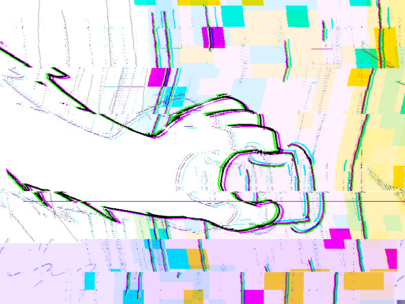
Still, I wanted to go a little further with some of the other effects, namely the panel where Coral touches the handle of the door. This was the first time in the comic where we see a transition point between worlds and I wanted it to be memorable. Here’s my process for that:

I started with this, a mostly-untouched version of the panel. There’s some minor glitch effects on there but nothing too major, just the multiple copies of the lineart and those pixel effects. I saved this image as a PNG file and then reopened it in Clip Studio Paint, at which point I cut it up into bands and applied a bunch of skew transformations:

We’re getting somewhere with this, but we’re not quite there just yet. It’s a little more chaotic, sure, but it’s not exactly screaming “my graphics card is dying” the way I wanted it to. If we want to take this effect further, we’re gonna want some genuine, no bullshit glitches in here. Let’s break something!
To achieve this I saved that image as a PNG once more, and then I opened it in Notepad++.

You’re not really meant to do this with a PNG file but we’re here to do things wrong on purpose, so this works just fine. This is a cheeky little technique I picked up in my youth after learning about datamoshing on wikipedia – a bit of deliberate data corruption for artistic purposes. In this particular instance I scrolled down to about the middle of the document and then just started deleting chunks of text. Each time I did, I’d open the PNG in an image viewer and see how it looked.
Eventually, I got something that looked like this:

Perfect. What a mess! I didn’t know I would get something exactly like this when I started this process, but I was expecting something real crunchy, and this fit the bill. I wanted to overlay this back on top of the original image, but that ended up looking too heavy handed:

No matter! Noticing how much of what I didn’t like about this effect was pure black, I took the glitched image and changed the layer mode to Difference:

There we go! A difference layer is subtractive, it literally subtracts the colour value of the layer from layers below it. Since the value of black is all zeroes, you’re subtracting zero from the layers below, and so there’s no effect. This removed all the black elements entirely while still leaving me with the nasty crunchy stuff I liked. Then I layered that difference layer back on to the original image:

Fantastic! I did want to take it just a little bit further still, though. For my last trick I saved as a JPEG and did the same trick as before, deleting some characters out the middle of the file in Notepad++. The effect here was not nearly as dramatic, it basically just made the bottom of the panel more purple. But still! It was a fun little flourish.
How instructive! But we’re not yet done. I wanted to do something similarly glitchy with the background, and for that I needed a similarly glitchy base to work with. In this case I used a variant of the Love Bomb background with a searing teal background:

I saved this as a png, as normal… but then I went to the second step of opening it in Paint.NET. This is another more archaic art program that is, frankly, kinda jank, but it has some options while saving that many other art programs do not. Chief among them is Interlacing:

Interlacing a PNG is a method used to make it load differently online. Essentially, instead of encoding the image starting from the top and working its way down, it tries to start with pixels sampled evenly throughout the image. The purpose of this is that it means if you’re loading an interlaced PNG on a really, really, really slow internet connection you can get a blurry low res version of the original image as it loads in instead of just having to tide over your imagination with the top 10% of the picture.
Anyway most art programs don’t bother to offer this anymore because internet speeds don’t suck nearly as much shit as they used to, but it’s still useful for us because we want to try some - you guessed it - deliberate data corruption! Look what our background looks like after we interlace it and then delete some characters out of the middle:

Fantastic! From there we just chop it up and mix it in with slices of the other backgrounds and we have something nice and messy for the background for the glitchy transition between worlds:

There’s also some deliberate replication of some of those artefacts in here– you can see a black line of pixels in an odd arrangement in the original glitched background which I’ve recoloured and pasted over multiple times in this sliced and diced version. And there we have it! With our knowledge of computer science we’ve created a nice and memorable cap off for chapter 2. Wonderful!
Peri appends:
Not too much for me to add on this one, as often happens with art-forward pages. The one thing I will note is that at least as of now, this page is the last instance of hover text in the comic. Across Chapter 2, hover text appears on panels with elements that have glitched into the wrong game, showing error messages associated with them. They provide no load-bearing information (that way readers aren’t missing anything if they don’t notice it), merely flavor text to enhance the feeling of “something is off” when the game elements start to cross over. This comes to a head on this final page of the chapter, when Coral grips the door and the error messages go into overdrive.
We made the decision to discontinue the errors in the hover text after this. Beyond Chapter 2, glitches become more common and crossed-over game elements essentially omnipresent. Lum ruled that continuing to include it would be more distracting than beneficial, especially since it becomes rather ambiguous what elements would be significant enough to warrant hover text. This is probably the safest decision for the comic, though a part of me still hopes we can find additional creative uses for hover text in the future. It’s one of those unique storytelling elements that you can only use in a web medium, so it would be cool to see how far we can take the conceit.