SamSuka
krysdecker
krysdecker

patreon


Ada Wong

Hey everyone, a day late but it's finished!

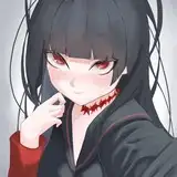
Personally, I wanted to make the image even darker (kinda like a noir image) but I can't control everyone's monitor brightness/contrast so it would risk losing a lot of information lol

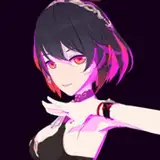
It was really interesting to make a pin-up fitting for the theme, since the game is extremelly monochromatic and dark, so I went for that 90s detective office theme. It's a very big contrast with Vereesa's image that has vibrant colors and a much more "fun" mood lol.

So I hope you guys like it =D

Ada Wong

Comments

badum tsss lol

Lee

thank you! Glad you liked it =D

Lee

Well.. I don't see anything "wong" here! XD *rimshot*

Tucker Mapes

Love it, absolutely incredible work. You never cease to amaze!

Felix Drake

Thanks! I thought 2 light sources would frame the image better, because if only the window was the light source, the left side of the image would be too dark. And it does have the idea of a "calm before the storm" =D. And it's always nice to see how people read the image, because there's a lot of room for personal interpretation.

Lee

yeah I really wanted to capture that "90s detective/thriller" vibe. I think it would be a lot more fitting for her outfit =D It only missed that smoke from a lit cigar burning in the cigar tray lol

Lee

Definitely worth the wait! Personally I like the darker style you chose for this painting. It works to calm the image adding to peacefulness of the moment. Everything is more peaceful in the dark. Additional I like the two light sources you chose to include. To me it seem like a contrast between the soft peaceful light of the lamp to the almost violent intense light from the lightning. It seems to foreshadows things to come for Ada. Maybe I'm simply reading into thing too much, but it works for me 🙂. Beautiful work as always. Thanks Krys.

Chris Harris

There isn't a B&W version. It would have to be painted from the ground up to work as a B&W. When you paint on values (like I do), you are setting up to add color later, so the contrast of the image is very different. And it's not something easily adjustable. But I'll make sure to include a brighter version on the rewards just to make sure people don't miss out the details on darker monitors.

Lee

Loved the dark effect, but I'm missing some details due to my monitor limitations. I think it would be great if you released the black-n-white drawing too.

Now that is quite something different, I like how you chose to work with darker colors. The mood of the image is great. But I guess a fan art of this particular franchise kinda sets the tone already. Still it's a very much welcome change.

LoneWolfGeorge

Thank you! Glad you liked her =D

Lee

Thank you! The color difference is slightly "intentional". My 2nd monitor is my cintiq tablet, so I leave the color balance in it, more saturated, and my main monitor is a little more "cold". So the color I chose is a very light blue which might become whiter depending on the color balance of the monitor. I keep the differences between the monitors to make sure the paintings look good on a different range of colors. And every now and then it might create subtle differences on them =D As for the colors, I created a new layer on top and intentionally saturated a few areas to actually distort the colors a bit. For example the blue streaks on the wall, and the purple streaks on her stockings. Since the image is very desaturated, this helps to bring a subtle color variation on the image. I also had to increase the shadow between her tighs a bit, because you could clearly see the underwear, and I think this way not only does it look more elegant, but it adds a bit of mistery. Leaves more to the imagination in a way =D I also had to slightly change her lingerie under the dress to actually be a functional lingerie, so there's room for more variations (which are really interesting btw). And I have to agree 100%. I love how elegant she looks =D

Lee

WOW!!! I love the lighting and colours in this piece, you've captured such an intense sense of atmosphere and mood with this one. There's so much going on that I scarcely know where to begin! 😹 Well, firstly, the background really does look terrific with all of the textures for the walls, the window-frame, the clouded, rainy sky, and Ada's coat draped over the edge of the desk. The way the lighting affects everything is stunning with the soft glow of the lightning fill sky illuminating the area to the side of the window, with darkness at the centre of the room behind and below Ada, while the lamp adds yet more light to frame that overall centre darkness. The little particle effects that float in front of the window and below the lamp are great little details too, as are the rim-lights on the stem of the lamp, the edges of the cup and the edges of the table and coat. The coat in particular is very nicely donw with the rougher textures of the material and the way the rim-light on top merges down into the folds. And I really like the start lighting on the window-frame and how the planes are defined and as always, with the background outside of the window, you've really given it a great amount of detail but without distracting from the main image. Now, I have a little bit of trouble knowing how to describe the light and colours going forward because on my tablet, the image is darker with the lights being more blue. While on my PC monitor, the lights are more white with the image being overall brighter and I don't know which screen is more accurate to what you painted 😅. Just to be clear, that's NOT a criticism of the painting, just me pointing out the discrepancies between my two screens. For the sake of the comment, I'm going to look exclusively at my PC, although the tablet image is definitely a lot moodier and the blue lighting creates some gorgeous contrasts. Anyway! Ada looks utterly fantastic here with the rim-lighting that runs down the edge of her face, shoulders and arm, contrasting very nicely with her skin tones and really letting her pop even more from the background. I especially love those same rim-lights on her tights as they pop even more against the dark material. The rendering of her hair and the tights looks terrific too, the definition of forms is a lot more subtle since they are so dark, but that definition is absolutely there! Her hair has an appealing little shine while the anatomy of her legs is great with the hard edges defining her knees and calves, as well as with the plane changes underneath her right thigh. I adore the rendering of areas such as her neck, clavicles, breasts and her right bicep and the entire length of her left arm with the blue/white tinted lighting adding this cool effect to her skin tones that is very striking! While the anatomy just looks fantastic too! The neck area is amazing, as are the plane changes at both of her elbows and I really like how the lamp casts a rim-light onto her forearm and fingers, really accentuating those areas. The rest of her clothing is so very well done too with the rippling folds in her dress and the texture of the red material which looks simultaneously smooth and subtle shiny. The folds to the side of her thigh look especially good with a bit more light hitting that area, creating more light and dark contrasts. Oh and lastly, since I zoomed in to see that area more, the blue/white rim-light on her face really is gorgeous! It pops beautifully against the shadowed tone of her face as well as nicely illuminating her lips. I also love how that light wraps around her chin and jaw too. Absolutely stunning work on this piece! 👏👏👏👏👏 Not only does Ada herself look beautiful and elegant, but the whole atmosphere and feel of the painting/scene really is brilliant, you should be very proud of this one!

Ciarán M

She looks amazing!

Mikołaj Balasa


More Creators