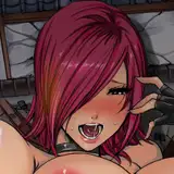
Uh, oh... that poor poor knight... ^__^
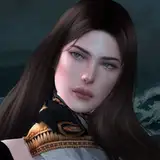
The play with shadows and highlights is very good. Makes it a bit hard to understand, where her legs are, but the harsh lighting works especially well on her head and her hair-strands (and the horns!). The face is really well done in this one, the symmetry of the face was retained, no deformation or perspective errors. Very very good.
(also, the tree behind her almost makes it look like she's got wings. Don't know, if that was on purpose, but it is a funny food for thought when viewing this image).