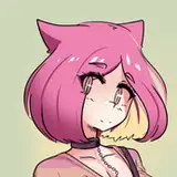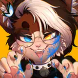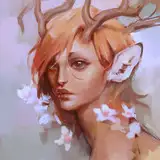
I had a huge pleasure to create a portrait for this awesome man!
________________________
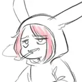
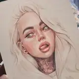
On the pictures you can see the process. At first I make various pencil sketches to catch the character, then I start with:
1. RED LINE SKETCH:
I realized that it's easy to loose your first concept sketch when you add colours and blending. That's my way to avoid it – I use red colour to make a sketch (or other vivid shade that will not appear in final painting
2. COLOUR PALETTE:
It's easy to be confused about digital art because you have endless shades to use! To keep my artwork consistent I create colour palette as a direction of my painting. Later during painting I add more shades but they are still pretty similar to the core.
Remember to ask your client about the favorite colours
3. FIRST LAYER:
I add layer UNDER the red sketch layer and fill it with general colour placement.
4. NEXT LAYERS:
I don't like to work on many layers because I get lost easily. That's why I work only on 1-5 layers at the time. When I decide something looks good I merge (connect) those layers and start a new one on the top of them. It's important to work from general idea to the details.
5. FROM RED TO NEUTRAL:
I change the red sketch to neutral colour by decreasing the saturation of the layer. Sketch changes from red to black and it blends into the drawing.
6. FINAL STROKES:
I do the last touch ups and details to finish the painting
________________________
It was made in Procreate (IPad Pro 12,9) with:
1. Sketch - dry ink brush
2. Colour - niko rull brush
3. Bledning - salamanca brush
I don't like to use many different brushes. I think it's not necessary and kinda confusing ¯\_(ツ)_/¯