Hi guys! 🧡
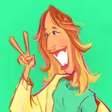
Here's the Step By Step of the Digital Painting I did this month. I have the impression that every time I paint digitally, I do it in a different way because there are so many of them! This picture is painted without an initial sketch, which was extremely difficult for me.
Here is the Step By Step.
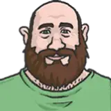
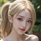
1. REFERENCE PHOTO
I chose this photo because of the beautiful forms of light and high contrast. You can find almost completely black and almost completely white areas here. It's completely different from the references I choose for my drawings, which usually have fewer shadows.

2. BIG FORMS
I started by choosing an average background color - the one I could see the most on the photo (dark green - 1). I put the black hair shape on the next layer (2) and the face and neck shape on the next (3). All colors are medium - not the lightest and not the darkest from the reference.
Next I added new layer and started to paint lights of the face. Not very accurate - with a big brush. All these shapes are made with "Gouache" brush from Procreate.

3. LIGHTS AND SHADOWS
I put the general shapes of highlights and shadows on the same layer to blend them later. Remember that you can get intermediate tones by blurring between light and shadow, so you don't need to paint them. I used more reddish tones on the nose. I marked dark ovals to put there eyes later. It's kinda like sculpting with the light.

4. CREEPY PHASE
Here, my main focus is noticing warm and cool tones of lights and shadows. I painted greenish shadows, orange light edges, grayish whites of the eyes and medium lip color.
I've marked where the irises will be.
I tried to paint as it was a traditional painting so I didn’t use many layers, maybe 3 for the whole face. I used "Eaglehawk" for smaller elements but actually gouache worked pretty similar.

5. LIQUIFY & BLUR
I used the "Liquify" (push) tool a lot in this image. I treated it a bit like sculpting in modeling clay and it was quite pleasant :) For example here you can see how the hair form got smaller.
I smudged the edges between some of the contrasts to make the skin more smooth. I used the same brushes for painting and smudging.
For smaller details here (like lashes) I used "Fine Liner" brush (from Mango Manko custom brushes).

6. OVERLAY
I added triangle, light green form under portrait and above the background. I used "Lasso" with a "Feather" mode to make it with blurry edge.
I picked each color separately from the color wheel, by watching the colors at the reference but I wanted to show some more light so I added one layer in "Overlay" mode (you can see it in the ray of light that crosses eyebrow on the pic on the right).
I used the Liquify (push) tool a lot to correct my mistakes of the proportions. I pushed the lips back and forth like a milion times lol.

7. FLATTEN
I flattened the portrait layers and the background layers separately. I continued adding details such as skin irregularities ("Flicks" and "Bonobo" brush), details of the eyes or dots on the blouse. I added more background lights - orange, abstract, blurry forms.

8. SMOOTH VS SPLASHY
I painted a smooth painting first (photo study) and made it more messy at the end. I like this effect - it looks like an oil painting, but I like to have control over the splashing. That’s why I keep it for the final stage. I used Salamanca brush.

That's all!
Let me know if this form of Step By Step posts is ok for you. It takes much less time than preparing them in a graphic template so I can make them more often. But maybe you miss some info?
Thank you for this month everyone! It was amazing!
Hugs 🧡 Gaby