Hi Everyone!
Here are some photos and my thoughts from the process of painting Arcane Characters. Thank you Christina for suggesting colored pencils 🤗 I had so much fun! 🧡
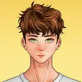
1. EKKO
As you know at first I made pencil sketches in Arteza Sketchbook.
Had some problems with this expression and shape of Ekko's lips but eventually I liked this sketch a lot. As you can see I created contour of the portrait and devided it into shapes to mark features and general values.

When I decided to draw the characters with colored pencils I checked how they will fit in the Talens Art Creation sketchbook (A5).
I cut pencil sketches out of the photo and arranged them in the photo of my sketchbook (in Procreate). I didn't have to transfer my sketch because looking at my simplified drawing was easier and I could do it quicker.
Also I didn't wanna use carbon tracing paper because sketch would be too dark.
I picked orange and dark red (almost brown) crayons to make the new sketch because portrait has warm tones on the reference picture.

I lost myself so much in the drawing process that I forgot about taking photos, sorry. But here's what I did:
A) I gently applied dark red ("Tuscan Red" Prismacolor) to the shadows.
B) I added vivid red ("Poppy Red" Prisma) to the eras, eyelids and cheeks.
C) Used "Lilac" to the shadows on the chin and inside the collar. Also added a bit of "Light Aqua" to emphasize the shadow under the chin.
D) "Light Peach" for the face painting (the shape painted on his nose and forehead) and for the general colour of the hair.
E) In the end, I had a little fun correcting the contours and details of the hair with different colors. I also added a background in a cool shade to contrast with the warm oranges in the portrait.

As you can see the main palette was made with oranges and purples. As a contrast, I painted a green/turquoise background.
I like to use background colors and add them a bit as details of the portrait - it looks a bit like colored light reflecting off the characters - then the background and the figure become one image.
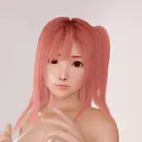
2. MEL

Recently, I really like to draw an initial sketch with two or three colors. It allows me to "code" a bit better which of the outlined values will be cooler and which will be warmer.
I also noticed that I always try to follow the contours very carefully. I believe that the correct outline of the whole character is often 70% of success. Even if I'd draw only the outline of Ekko or Mel - they might be quite recognizable.

I used Polychromos to make all the initial sketches because they are great if you need to erase your mistakes and sketches can stay very clean.
I used yellow crayon to paint the light parts of the face and purple for shadows. I added red/orange to the nose, eylids and the transitions between lights and shadows. I mixed green and dark red to shade the hair and added some blue tones to it.
I corrected the outlines with "Tuscan Red" and a little bit of Navy ("Indigo blue") crayon.

In the end, I added golden Gansai paint to some details: freckles and the jewelry.


I think I had some issues with the very dark value of her hair and the shadow on her cheek. I could have used too many colors and it got muddy. I am not sure yet how to deal with such dark values with crayons.
Honestly, I also don't like super dark values in graphite drawings. Probably because it's more natural for me to use lines and do quick sketches than to render very dark and large planes.
3. JINX

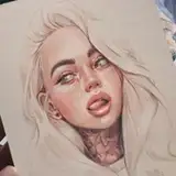
Jinx on the reference is very pale and her features are quite "minimalistic" - only the eyes are very exagerated. Her characteristic feature is hair (colour and shape). So I wanted to outline the whole portrait quickly, and then emphasize only the eyes and hair.
I like the effect and I think that this minimalist approach suits me better than mixing colors and layers in a long process.
I like the red background contrasting with her overall "blueness". It looks a bit dramatic, especially with her expressive gaze 💥

4. VI
I like this drawing the least.
The reference seemed very cool in tone to me so at first I just wanted to draw bluish skin and pink hair but everything seemed too flat to me so I added orange and purple to the hair and also bright green to the face. The sketch was quick and a little sloppy.
Maybe I'll draw Vi again.


Materials:
• Talens Art Creation Sketchbook
• Prismacolor Premier Soft Core
• • •
That's all 🥰 Thank you! Have a pleasant day/ evening/ night 🧡
Gaby