Hi everyone!
This is the fifth post of a series based on observations of my students' exercises on Domestika.
You can find previous guides here: Part 1, Part 2, Part 3, Part 4
__________________________________
In today's post I’m going to focus mainly on the head form, angles, face contours and the hair.
MISTAKE NO 1: NOT BEING AWARE OF THE ACTUAL HEAD ANGLE
In my Domestika course, students are asked to draw three portraits: in profile, in 3/4 and in front. The problem arises, however, when they start looking for their own reference photos. They often confuse these angles with others. It is very important to be aware of the position of the head when drawing it. The incorrect assumption will be visible in the drawing.
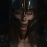
In this photo you can see the face in 3/4:

In this photo, the angle of view is not as obvious, but you can still simplify it:

Try to simplify what you see. Determining the center line will help you in this. At the very beginning, carefully analyze the arrangement of the head and its nuances.
MISTAKE NO 2: DRAWING OUTLINES WITHOUT THINKING ABOUT THE FORM AND PLANES OF THE FACE
The face consists of many simple forms. Even when they appear round, they can be simplified to planes. You don't have to draw them every time, but they are extremely useful at the beginning of learning. I recommend drawing in a very geometric way at the beginning to soften it over time but with an developed understanding of the form. That’s why my older portraits have been so sharp and geometric - I focused most of my attention on understanding of the form.

Without the planes, it’s easy to make many mistakes and deform the contour of the face.
MISTAKE NO 3: SHADING THAT CHANGES THE FORM OF THE FACE
Tracing photos can be helpful, but if you don't know how to shade them, you won't get a good result anyway. Even a very good contour can be “broken” if the shadows are placed in inappropriate and illogical places. It might look like a weird make up or sometimes, it will even deform the face.

If you have this problem too, study still lifes to learn proper observation of light and shadow.
NO 3: LOST CENTRAL POINT AND LACK OF A SYMMETRY
In this aspect, I often have a problem myself. Most faces are not perfectly symmetrical and we usually do not see them completely from the front. However, what is ok in nature does not always look right in the drawing. That's why I try to draw more symmetrically than I see in nature. Unfortunately, it is not always easy. When I have this problem, I take a picture of the drawing and flip it horizontally to find where the problem is.

MISTAKE NO 4: INCORRECT PERSPECTIVE
This is another aspect I have problems with. I'm not very good at perspective drawings. I can draw in a certain way, that it looks like I know what I'm doing, but this is not always the case. I know the basic rules and I can see when something is wrong, but I get lost in more complicated sets. As we all - I need to practice more :)
Here you’ll find some of my tips on perspective: LINK

MISTAKE NO 5: DRAWING ONLY FROM IMAGINATION/ MEMORY
Many of my students fall into the trap of drawing only out of imagination, because they think it is a better or more fun solution. In fact, it's a good idea, but only after you have the basics of drawing from photos and from nature. This is not something that I would recommend to beginners. It is fun of course, and I like it too, but it cannot be the only way to learn if you want to avoid the basic mistakes. The mind is too tricky. You need to study reality.

MISTAKE NO 6: JAWLINE BLENDED WITH THE NECK
This is a very common mistake. Drawing the neck as if it was seamlessly connected to the head. In fact, there is a considerable difference in planes and depths that affect light and shadow.

MISTAKE NO 7: TOO SIMPLIFIED JAWLINE (TOO STEEP OR TOO SHARP)
I have a problem with drawing the right jaw line myself. These subtle curves are very difficult, especially when you see the face from below. Be aware of these subtle curves and do not simplify the line too much or emphasize it too much. Balance is the key. (As always :))

MISTAKE NO 8: UNDEFINED OR BULGY PROFILE LINE
The profile line is one of my favorite things to draw. They have a lot of character. Try to find its subtle curves and line balance. Note which lines have more angular bends and which are more rounded.

MISTAKE NO 9: TOO LARGE FACE/ TOO SMALL CRANIUM
As people, we tend to focus on the face (because it shows emotions we can read from) and therefore we often draw it quite large, but it is actually much smaller than the head.

MISTAKE NO 9: TRYING TO DRAW EVERY HAIR
Remember that you don’t have to draw each and every hair separately. It would be very time consuming and pointless to draw thousands of hair. Treat them as one object. Simplifying in drawing is like seeing something from a distance or with squinted eyes. You wouldn't see each separate hair or each tooth. Try to mark them in general

MISTAKE NO 10: VERY HIGH CONTRAST AND TEXTURE OF THE HAIR
When you draw multiple lines, the hairs become contrasting with the whiteness of the page and create a very sharp and crisp texture. It takes the attention away from the face that plays the main role in the portrait. Soften the hair contrast to avoid this.

MISTAKE NO 11: REGULAR AND CLOSED OUTLINE OF THE HAIR
Closing the hair in the contour makes it look like a wig. Break lines to show their natural flow.

MISTAKE NO 12: TOO BIG OR TOO SMALL DISTANCE FROM THE FACE TO THE HAIRLINE OR JUST A WEIRD HAIRLINE :)
This is a very common issue with which I also have problems. To perceive the actual distance, I take the size of the other face element that is more specific to me - as the unit of measurement. For example: how many eyes would fit in this place? Compare reference points to find less obvious distances on the face.

MISTAKE NO 13: LACK OF VOLUME OR TOO MUCH VOLUME OF THE HAIR
This mistake is often related to the fact that we do not think about the skull that is hidden under the hair. Also, we often make this mistake when a photo is cut and we try to "guess" what the rest of the head looks like. If you have trouble with this, remember to mark the line of the head before adding the hair. I like to draw them a bit more fluffy, but I remember about gravity and if they could actually be arranged this way.

MISTAKE NO 14: TANGENTS
A tangent is when two or more lines interact in a way that creates a relationship between them that the artist did not intend. I wrote more about it in this post.

MISTAKE NO 15: REPETITIVE SHAPES OF THE HAIR (NO HIERARCHY)
Hair is never regular, unless it is an exceptional ambition of a hairdresser or a intentional styling of a cartoonist. However, even a very simplified form will contain large, medium and small elements, not just regular and the same shapes.

Treat the hair (and other elements of your drawing) as if it were a graphic design. Create balance, composition, hierarchy and interesting shapes. Guide the viewer's eye in a conscious manner. It will be difficult at first so you will use the trial and error method but it will become more intuitive over time.
____________________________
That's all for today! Let me know what you think 💭
Hugs! 🤗
Gaby
Doodl.Artist Jessi
2022-08-17 09:15:26 +0000 UTCCezary Łobiński
2022-08-12 08:30:27 +0000 UTC