Okay, what about this font instead (the word bubbles still need a lot of adjustment)? This is Blambot's Milk Mustache. It still has some personality, but is a ton easier to read. It's also kind of a narrow font, which makes it easier to use.
The last one was Blambot's Indie Star. I've always wanted to use that one in something, but I never do, because needs to be viewed big.
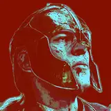
TF Commando
2020-09-24 21:18:00 +0000 UTC