![[process] Theurgy extra pg1](https://img5.samsuka.com/storage/3/gc/zf/c6f9d9-019e84eb-a6d6-778a-b2b7-d7bedecbc337.jpg)

ALRIGHTY trying to show some other info in this one to mix this up a bit!
1. Layout sketch on paper - This scene's process ended up a bit different because I was in a bit of a rush with the deadline for sending the book to print, SO I tried to make the layouts a bit more detailed because I was gonna try to skip the 'pencils' stage alltogether
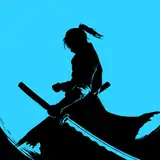
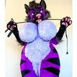
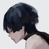
2. Inks - I skipped my normal sketch stage in between here to try to save time. To make this easier on me, I also used a softer 'pencil' brush for lines instead of my normal inking brush. Pictured on the side here are some 'tools' I use for drawing - the top one is a posable figure I have. It honestly isn't that useful for actual posing BUT i sculpted a little horn onto it so I can use it as a reference for different angles for Des. The bottom photo is from an app called "Magic Poser" which I used here for a reference of Des's face angle in that bottom panel.
3. Flats! I told myself I was gonna keep the colors on the extra simple but I guess I have no self control so that went out the door. Des's shirt in this scene is based on one I own, Gabe's is a simple plaid color combo I found on pinterest that I liked -- but that meant I had to hand draw plaid on every page sighhh
4. Added shading on a multiply layer
5. Added demon details - the dark 'poof' and the glowy eyes
6. A look at my "adjustments" folder on this page and the final page - This folder is on top of everything except for the text. From BOTTOM to Top, the layers are: The previously mentioned demon poof, the glow around Des's eyes, an overlay layer with a dark red gradient from the bottom of each panel, a layer on "soft light" with a light yellow for the light from the window, an overlay layer with an orangey-red gradient to adjust the tone from the window light, two layers of the like.. dust particles in the air in that first panel, and then finally a color adjustment layer with the red and yellow bumped up a bit to make the colors just a bit warmer.
All done!
Jennoasis
2020-01-03 23:47:51 +0000 UTC


![Someday*[サムデイ]](https://samsuka.com/istorage/107168.jpg)