Episode 2 UI Update
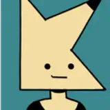
Added 2018-07-05 10:35:29 +0000 UTCSo I have been working quite a bit on the UI the past couple of days, and I think I'm close to finding a layout that I'm happy with.
The actual graphical components are still placeholder (and mostly just basic colours) but please take a look at this, and let me know how you feel about this layout in comparison to the one I've been using so far~

Just as a quick clarification here is the list changes:
- The "action buttons" have been removed, and will now dynamically spawn as part of the description text itself as and when needed as opposed to always being visible and taking up a good chunk of the bottom of the screen.
- The navigational buttons (East, West, North, South) have been moved to be part of the minimap itself.
- The "Inventory", "Phone", and "Menu" buttons have been compressed - for lack of a better term - and put into a "tab" system that should hopefully be more intuitive than having buttons on the left side of the screen controlling menus on the right side.
- The "Character" button from the previous UI has been replaced with a small arrow on the top left of the screen which will display the character window when pressed, and the equipment panel when pressed a second time.
- And lastly the "HUD" button has been removed, I will instead turn the HUD off automatically whenever any lewd images are displayed, at least for the time being (additionally a zoom feature simmilar to the one in Episode 1 will eventually be added as well)
As always I'd be grateful for any feedback, doubly so on this one as I want to get the UI layout decided as quickly as possible so I can move on to more interesting tasks (Like writing a scene where Carver shows Samantha why he has such an interest for knots~ (the rope kind x3))
Until next time, have a good one :3
-Sammy
Comments
Looks good. Very streamlined.
BallisticBlue
2018-07-06 03:04:39 +0000 UTC