Nothing new to post, distracting/relaxing two weeks. More concept work and working shit out stylistically.
If you read manga you might be aware of the dot matrix style of shading, usually called screentone or halftone, used because it's a monochrome (therefore cheaper) method of printing. This would be physically done with literal sheets of decal stickers that would be cut and stuck onto the original lineaart.
Nowadays this can be done digitally. Every manga you've read in the last decade+ has likely had it's tone applied in Clip Studio Paint, and it seems to do it well. I dn'on't use CSP, I use Sai 2, which doesn't have a native toning ability and can only be done to a limited capacity with any brushes that can be found or edited (basically being used as a stamp).
Thing is, once you start dealing with digital distribution and image resolution, scaling, screens sizes, screen fidelity etc, the tones can get distorted or aliased into different patterns or outright smeared into blocks of gray - these would be unprintable monochromatically.
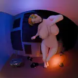
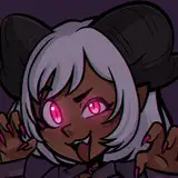
If you're used to my previous shading, or particularly how I draw Nagatoro "on-model" and her tan, you might have noticed than I pretty much pre-empt the entire distortion/downscaling process and use a pattern that evokes that look. This pattern has always however been a bit shit and inauthentic and bugs me, but the toens I have to work with are very limited. But the above is me really taking stock of what I have that's usable, how they look in practice, how they mix together, and is an opportunity for me to see how they look on different screens.
So yeah, you look at the girls, I'll look at the dots.
Szmitten
2024-07-05 19:56:39 +0000 UTC