SamSuka
sarahlin
sarahlin

patreon


Art!

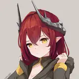
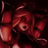
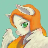
UPDATE: Sending out an update notification to show all of you a second draft of the cover. One thing I want to make clear: the grayscale and low detail is because this is a sketch, not the final design. But I definitely agreed with what people said about having a dark core, and I also wanted more rocks to show there is gravity manipulation going on. Any final thoughts before the artist continues work?

ORIGINAL POST: Audiobook previewers! If you haven't given feedback on NGM#2, please do. It will need to go up in audio fairly soon.

I put that up top to catch people's attention, but the bigger news might be the image above. I have always planned to do a combined version of TWC 1-3, which is one of the things I've been working on in the background. The above is the initial sketch concept. Not quite what I asked for, but close. Anyone have thoughts about the design before it goes forward? Recall that it will exist alongside other covers, not replacing any of them.

Finally, please look forward to a lore post next week. ^-^

Art! Art!

Comments

I like nebulas too, but seriously, one google search of 'black hole' gives plenty of reference, unless this is a marketing or artistic vision thing.

Runcible Technician

Yeah, I agree it should be crisp black and mostly circular with bright outline.

Jerek Kimble

I agree - the smoky edges are more reminiscent of a nebula than the clean boundary of an event horizon.

Lamsey

If you're going with a dark core I'd ask for it to be a bit crisper. It looks smoky right now, and I think you want a harder edge between light and dark. Having tracers of sharp bright lines might give it more of a black-hole vibe. Crib more of the Interstellar vibe and it'll look striking I think

Luke

The hills in the background don't really add much. You could put some funky alien architecture back there, really washed out so it doesn't change the first impression but adds something new on a closer look.

Jeff Petkau

Great first cut for an image would ask for refinent for the less gray cut out look of the guy himself. But overall a+ would click on that book cover.

Alison Stoneklifft

Looks great, I like the washed out look. I think the ball would be better as a bright rim with a dark center, but looks good either way.

Jeff Petkau

That is some rocking art, but just for lores sake I would argue that any light would be around the corona of the effect. Black holes look great on their own without dragonballing them up.

Runcible Technician

I like this art a lot! I agree that it may not be 100% loee accurate, but I think the eye-catchingness of the bright singularity makes it stand out nicely. If this is a cover that would show up in the Kindle store, I think it's a good one to entice future readers

Luke

It looks cool, but that looks more like a fireball than anything else. It would have worked better for his first blueprint.

Jerek Kimble

Looks good, but as the other commenters have said, that looks more like his original solar concept than a singularity. It should be sufficient to darken the central orb while retaining the bright corona around the outside.

Lamsey


More Creators