SamSuka
sarahlin
sarahlin

patreon


TWC Cover Decisions

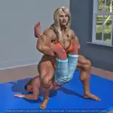
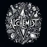
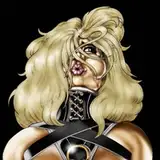
These images came in too late for yesterday's post... I decided screw it, I can make another one. The previous artist sent me these three, a combination of edits and different filters. Please speak up about your preferences or upvote comments you agree with.

Regardless, I need to make a decision soon, because the lack of covers is holding back TWC releases far more than writing. I have given serious thought to abandoning all prior cover concepts and just going with symbolic covers, because at this stage increased sales are worth less to me than not having to deal with this anymore. However, as I was considering that, these covers came in, so we can at least take a look at them.

If I want to continue this style, I need to contact the artist ASAP, because they take about a month to do covers at best. If I abandon it, I need to contact someone else. I've been leaving this on the backburner to focus on other work, but shouldn't neglect it any longer.

TWC Cover Decisions TWC Cover Decisions TWC Cover Decisions

Comments

1, 3, then 2 -- #1 has a real Goldilocks-zone feel to it, with regards to both the level of detail work and the magical "feel" of the image itself (particularly in the swirling energy whorls).

JasonD

That one is a tough call. I like the first, the art is better for if I was holding a book in my hands, but the second has sharper lines and is easier to see in a tiny preview window.

Runcible Technician

It would be really handy for me if everyone overwhelmingly agreed on one, but...

Sarah Lin

Funny. Like 2 the best....

Tao Wong

I like both 1 and 3. Pic 2 seems a bit faded out.

Al S.

Undecided between 1 and 3. But they're all quite great.

Rui Lourenço

3,1,2 is my preference. Thank you for this insight.

Kyle J Smith

I like the second one. Its subtle but it still catches your eye in a "hey I'm a lowkey cover of a great book" kinda way.

The dark blue is very engaging and I think would draw me in.

Cameron C

Dark blue

Alexander Dupree

The attention to detail and focus of #1 is something that I can appreciate. The color scheme of the dark blue for #3 is however at a glance what would draw me to take a closer look to begin with.

Brandon C Yee

1

Froyo Baggins

1,3,2, but both 1 and 3 are pretty good to me.

Chase128

This would be a new cover for the first book, replacing the original. If anything, it represents Theo designing his soulhome, but its only goal is to motivate readers on Amazon to click.

Sarah Lin

I like 1, 3, 2, but in all honesty this cover confuses me, it's not really a good depiction of the second book. Like there's no event in the book I can think of that looks like this.

JKincaid

1,3,2! But like them all

Karthic

I'd say 3, 1, 2, but I have a very minor preference for the symbol covers.

ECD

I like #3

Robert jacobs

I think #1 is the best. The increased detail in the rooms is good, and it retains the vibrant eye-catching colours without appearing oversaturated. The reduction in the amount of gold swirls also helps to bring out the blueprints. I think #2 is a little too subdued, since you want the cover to jump out at potential readers. Conversely, #3 is an improvement over the previous draft you showed, but I feel it doesn't go far enough.

Lamsey

I think I like 3 the best, but I'm not sure I like any of these better than the book 1 cover. I'm also a fan of symbol covers. I think the thing I'm not huge on with any of these is that it doesn't really match any of the soul home descriptions or mechanics we're familiar with, so it feels misplaced.

Luke

I like #2 -- the subdued one

Kyle Aretae

Same.

singletrack

I like the blue one, but honestly I prefer symbol covers, or just about anything without a character on it.

Good.T

1,3,2 in order of preference

Timothy Alexander

Im a big fan of the more blue soul home cover. I think these covers are great , I know that the symbol covers are easier but probably won’t grab new reader’s attention as much. Good luck!

CommodoreCaptain

I prefer the first one (has more details in the rooms) shows their foundation is firming up.. at least that’s my two cents.

Tenzen


More Creators