SamSuka
sarahlin
sarahlin

patreon


Two Random Covers

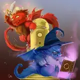
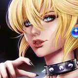
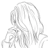
The covers you guys voted on will still be used at some point, but as I've suggested, I'm reaching a point where I'm happy to go with simpler covers if it means that the books can stop being delayed. Based on patron thoughts, I've decided to go with several different symbolic or non-humanoid covers. Not flashy, but they could work to establish series branding.

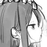
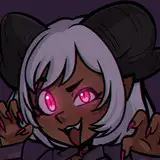
Unfortunately, some artists are much faster than others. I decided not to delay on this either: what do you think of the two attached this time? Different artists with different styles and aims. The idea would be that these would be covers for TWC books two through four.

Please note if you have strong feelings about these or notice any issues.

Two Random Covers Two Random Covers

Comments

Thanks for the feedback. I haven't mentioned it on Patreon, but I'm probably going with an edited version of the locket.

Sarah Lin

The deer like image looks like it has a huge nose when viewed from a distance due to not seeing the 3d aspect of the image. The locket seems thematically disjointed.

Robin

I like the image with the locket and pencil. It looks really nice and is fitting.

River furlow

Thanks for the feedback!

Sarah Lin

The locket looks good visually, but I don't see any link between it and the story, unless it represents a Weirkey which we haven't yet encountered in the released books/chapters. If it is intended to represent a Weirkey, then it might be better to replace the sword symbol with a representation of a fancy key (this would be a shame, though, since the artist's done a good job with the sword). The blueprints in the background do look good and are thematically appropriate. I think the Rainhorn cover is attractive enough, but not very distinctive. It'd perhaps be better if it looked like an actual Rainhorn head (i.e. with an iridescent coat rather than the abstract crystal-like appearance), mounted on the walls of a soulhome. To avoid the rainbow coloration making it look too cartoonish or childish, perhaps the fur could have an oil-slick sort of sheen to it rather than bright rainbow colours.

Lamsey

The locket one has a very visually appealing art style. I like it quite a lot. Notice the light and shadow play along with the grainy wood texture. Talented artist.

Rageflare

You can always update the covers later.

Jeff Kabat

Thanks to you and everyone else for offering feedback!

Sarah Lin

I like the locket.... but why sword?

Good.T

Good.T

I think the locket is very cool.

Cameron C

Locket definitely draws my eye

Luke

BTW been losing sleep reading The brightest shadow.

Alexander Dupree

One hundred percent the locket.

Alexander Dupree

I definitely prefer the one with the locket as well.

I like the one with the locket and drawings, it definitely draws the eye well and would make me curious. I would be more likely to randomly click it while scrolling through recommended books. The mounted head one feels a bit too simple / is less visually interesting?

Chase128


More Creators