whew, here's another one.
sorry for the walls of text in this one -- there are sometimes a LOT of elements flying around when making decisions for comics. it can honestly be really overwhelming on days where i am already foggy-headed, but it's useful to have the knowledge to be able to sift through it on any level.
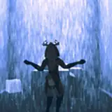
tangentially, when i was talking about the palette in this one -- it should be noted i generally don't like to let areas of the same color for different objects directly visually touch each other with no separation but a line in limited-palette works. it severely hampers the reader's ability to parse all of the information, hence why i was kind of instinctively against using any color for the doorway.
the green in that panel was added during the commentary process after i noticed that there in fact was a color i could have used and tested it out.