this is a comic i've started working on, largely because I Want To. i'd like to be able to print it one day, which requires a radically different format from how i've been making comics. images made for print are much larger than web resolution images, and those smooth, crunchy pixels don't hold their qualities when sized up.
to be honest, i've enjoyed my work with posca pens a lot too, and it's made me want to attempt comics like this traditionally. i wanted to compare what i could do in clip studio paint trying to emulate traditional media with actually attempting a comic traditionally with paint pens.
i knew right off the bat that i hate sketching traditionally. i sketched a test comic digitally, and then found myself unable to transfer it to an appropriate traditional medium. painting on cheap printer paper is a bad idea (lol), but i uploaded what little work i did on it anyway to compare. i was much happier with the digital-only results. they'd also be easier to edit when issues inevitably arise trying to print this. i could have invested in a light box to paint over, but i just didn't feel like dumping money into an art supply i probably wasn't going to take to if digital seemed to be working out.
the brushes i used digitally were procured from a kind individual on twitter (@judaciously) who gave me his entire backup brush archive to download what i wanted from. i only downloaded the paint-related brushes, and from browsing the CSP assets section while searching for keywords.
for lines, i ended up liking most using the default ink brush, and then adding texture with the dry ink brush below it. a downloaded tool called "sketchy brush" is what i use for the lettering, speech bubbles, and borders. i also used the sketchy brush for, well, sketching out the page.
the colors themselves are made with a large (to me) combination of downloaded brushes called "RNG wash" (with edited settings i tweaked myself) and occasionally the "chaos" variant of it; "flat brush"; "sponge bub"; "textured dry"; and once again the two aforementioned ink brushes.
the flat brush and textured dry were used to fill in large areas so that they had depth and texture, like actual ink put on paper. i used them interchangeably during the process to cover up the "samey" feel digital brushes can produce if used too much by themselves. the RNG washes and sponge bub tools were used to go over the initial filled areas and further obfuscate the too-clean texture created by the digital brushes. the RNG wash was also used to add depth and smooth out shadows -- it's the brush that looks like watercolors.
the total amount of layers used was 4: one for the sketch, one for the lines and simpler backgrounds, one for complex backgrounds to avoid forcing me to reline over and over, and one for white lines on top and other touch-ups. i imagine there will eventually be a fifth layer for quick color-editing for print. it should be noted that i intentionally allow some of the sketch to show through in the end product to add color depth. i went out of my way to erase and cover up parts of the sketch i didn't like showing through at the very end.
the bulk of my time was spent covering up the digital nature of the comic. it was enjoyable, but i felt like i was walking in snow backwards, so that i could cover up the footprints i was making. at no point did i feel like i knew what i was doing, or that the brushes were working the way i wanted them to. this made the process overall a little more stressful. i feel like i would need to take more breaks between or during pages.
some problems i noticed with the process are that it was hard to keep track of the colors i was using. i was working in a CMYK preview, and that made the actual colors of the file very different; the colors my eyedropper was picking up were also different from what i was seeing. now that i know what the command bar is, i will probably save a minimalist palette for this work so i don't continuously jump around except for hand-tweaking color depth.
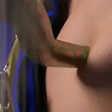
another problem is that these brushes tend to lose the ideal texture they offer at larger sizes... this page is around 8.3" by 5.4" -- an unorthodox, and somewhat small set of dimensions. when sized up, i noticed there was virtually no damage to the quality, though, once it was finished. there's so much texture in the image already that the computer doesn't struggle much with resizing. i might continue working at a slightly smaller size and sizing up. i know that i want the book to be kind of wide compared to usual comic sizes, but i'll prod at some actual comics to see which size i like the most for actual dimension reference.
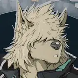
another problem is that i struggled finding a brush adequate for smaller details, like the ridges on drake's neck. i will need to work on this more. i want them to be obvious like ink hatching, but i don't want them to overtake the image's focus.
the last problem is that i'm still not really sure how to handle the issue with dark-on-dark when it comes to the lines and backgrounds. the white lines look more awkward and confused than i thought they would. they sounded cool in my head. you can see in the closer panels, that there is more of a subtle white halo around drake to help distinguish the lines, but this becomes less feasible with zoomed out shots without being really obvious. i'll need to look at more references and play around more with both how i sketch to account for these issues preemptively, and how i handle them as i color and line.
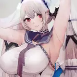
a lot of this story is still undeveloped. it's been a very different process from the one catharsis went through. i developed the character personality summaries by writing a couple of scenes between them rather than the other way around. they're also developed in a short amount of time with clear thematic goals in mind, rather than more organically over a few years. the story itself has functionally little plot and works more as a character study than a three act structure narrative. my work on it happens more with strokes of inspiration rather than on a schedule. the tone of the story itself is more surreal, and less bent towards performing believability -- many objects even in the last panel of the test comic will probably show up in the final room design because they are thematically relevant.
however, i wanted to know that the end product i had in mind was actually possible for me to make with different tools from what i'm used to using before investing too much time into the story. i still enjoy the sketches of drake that i did in binary pen the most, but, c'est la vie. i have preferences and i know them.
my next step will have to be creating lambton's design, and ironing out further issues with drake's design, like how xyr glasses function on xyr face hierarchically (this will decide the entire story's stylistic choices), the length of the arms and the hoodie's sleeve shape, and how xe looks hunched down further like in the red sketches.
story-wise, i will need to come up with various questions i want to tackle about species dysphoria (and transition) as a concept to decide how many scenes there will ultimately be in the comic. from there, i will know how many steps i'll need in drake's transitional design.
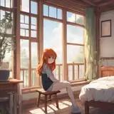
the room itself, i will probably design after the first draft of the script is done, because i have a sense that i'll get prop and setting ideas while i work on the scenes -- the window, for example, was only something i really developed after deciding drake would have chronic pain and migraines.
also, i still need a title. i feel like this will also be generated by writing more of the script itself -- probably part of a meaningful sentence somewhere in the story.
i'm hoping that by writing about the development of this comic, that it'll be more obvious that comics can be created in a variety of ways.
my drawing style doesn't give a whole lot of insight into making comics in anti-aliased styles with many complicated visual tricks made available by digital programs, and my planning for stories may appear dauntingly complicated and lengthy -- especially to someone who has never made a comic before.
the process, overall, will be more similar to drop-out's production, when i had no comic experience under my belt.