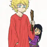
hi. i did another run through color tests for idletry. i'm really happy with how the style is coming along, but it needs a lot of work, still. the other comic i posted with this is the previous test and how they looked printed out.
the main issues i had while doing this strip's colors were... well, first of all, the fact that this was not drawn to accommodate speech bubbles or colors in some cases. that's fine though.
color-wise, i had no idea how to incorporate shading. i still have no idea. some of the time i like how the shading looks, but sometimes i don't. even what i consider simplified, stylized shading targeting only specific areas of the body, like under the chin and sleeves, didn't work well, because the characters for this comic tend to have thicker necks that are not necessarily distinct from their jaws.
that isn't even addressing the issue of picking colors for shading. i'll need to work on that further. i know that it tends to look better in close-up shots, but i'm not ready to relegate shading to only closer shots (even in the bust shots i disliked how it turned out a lot).
another issue i had was that i didn't pick CMYK-friendly colors here. you can see what print does to colors in a color blot page i printed out as well. i'm willing to literally take a second pass over the comic to alter colors for CMYK, but i will still need to practice to know how to do that.
i'm also unsure how well this will work on a format that also uses rows of panels and not just one straight column.
about the style itself... i started by feeling inspired by Mady G's color work, particularly in "be gay do comics"... i ended up picking colors that changed drastically based on whether they were in the foreground or background. it branched out from there.
colors are selected with ~5 primary methods:
1) selecting for mood. the red foreboding panels need no explanation for why i picked them.
2) selecting one color i wanted to be dominant, then coloring the rest of the image around them, usually making the background either complementary or neighboring colors.
3) altering colors from the previous panel to "slide" the hue to a nearby color.
4) selecting for symbolism. many panels have hot pink or teal as representations for jessie and shiloh either overtaking the panel or lurking in the background.
or 5) copying a previous panel's colors as a reference or callback to the previous panel and its contents.
these methods can obviously be combined, such as with the three shots of the city, which slide to progressively go from blue and green to being overtaken by pinks and purples, so 3, 4, and 5 all contributing to palette decisions.
i've really been trying to avoid nurturing "rules" and going with what looks nice and feels right, but a list of my reasoning can make it easier to understand how i got to the choices here. i'm typing it now because i will forget my thought process otherwise, lol. some of the panels i left looking "bad" to me to have a reference for what i didn't like, and it'll all blend together without writing down what i was thinking.