hi again. you've probably seen a lot of these panels before, because i posted them in the last update. i wanted to post the entirety of scene 1's sketch, along with some other things. partially, it's because i want to make it obvious that i AM working on idletry -- the only days i don't work on it are when my hand aches too much -- and to write down a lot of the process of learning in this beginning stage. it will almost certainly even out by the first 50 pages, and i'll forget the smaller stuff that made it difficult at the start of the project.
i also included a screenshot of the second draft of the script; i've been making slight alterations to the dialogue for a variety of reasons (i think i already mentioned them last time), and when i make those alterations, i write it into the second draft in a specific marked color. i would like to keep the second draft's script as close to the actual events of the comic as possible, because i would like for the script to function as a somewhat underdeveloped, but viable transcript for the comic. unfortunately, for this scene, which got many passes prior to draft 2, the only 2 changes were added sentences of dialogue, rather than truly altering extant dialogue.
you'll see that the sketches are different sizes because i was testing out what was comfortable to draw at -- unfortunately, it's about 33% of the print size that's most comfortable for me. i now draw at a size that is, technically, identical to the size the comic will be printed at on a piece of paper. it will, hopefully, make judging panel size easier, if nothing else. it's only a dozen or so pixels' difference from the finished page's dimensions, so i'll just... literally be opening up the margins slightly on that one. i feel like if it sized up to exactly 300% of the print size, i wouldn't even have to reline it, but, as it is, the lines are just too pixely for print. of course, if i size it up to 300%, all of the sizes i previewed will be slightly off... and i did try to see if i could simply expand the margins to make it fit the page size, but the difference is over an entire inch of paper, and would be very conspicuous (also a waste of space).
page 5's sketch has the margin guideline overlayed on top of it to show how i was drawing vs how far from the edge i probably should draw... i believe that's the page where i started using guidelines. you can also see that in general, 4 rows of panels fit per page -- which is why i divided the thumbnail margins into quarters.
i used page 11 as a color test for various reasons, but, most of all, because the sketches have kind of sucked, and it's been frustrating. it all looks too simple. i thought perhaps it's only because it has no color or backgrounds yet. i do think the color and backgrounds help significantly, so i'll try to chill out a little about it. there are still parts of the sketches that annoy me solely because i had to give up and move on with my hand aching too much for more controlled movement, but i'll have time to go back and patch it up.
i included the RGB version, and the CMYK version of the test. it was annoying to work with krita, which has many strange and unintuitive choices for shortcuts -- for example, instead of deselect being ctrl+D, it's ctrl+shift+A; instead of the eyedropper being "i" it turns down the opacity of your brush. there's no way to just straight fill tool all of one specific instance of color, you have to use a separate selection tool, and then use the fill tool, and there's no way to turn off the dashed selection lines during this process as far as i can tell, which makes it difficult to see.
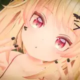
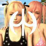
that's all just technical stuff, though... the CMYK was mostly straight conversion to CMYK (afga swap standard profile). i thought it didn't look too bad... unfortunately, CMYK will ALWAYS turn the bright colors dull, and the light colors dark. i mostly spent time trying to balance the contrast again. a lot of the pinks got really dark. if i had an endless amount of money the first thing i'd do with the print run is spot color that fuchsia that's sort of "jessie's color"... i selected it because it's an imaginary color; it doesn't really exist. it felt bright, unnatural, and i was more than happy to have her have some kind of pink color motif.
i think that's everything for now. i'm sketching scene 2 at the moment. my hand is still being whiny about everything, so i don't want to start lining scene 1 with it yet.