hi everyone. it's nice to be posting again relatively soon after the last post i made. this is a sketch of scene 2. i haven't gone back to line scene 1 or anything because i want more time to think on the compositions of some of these earlier scenes -- and my hand has been achey. lining is the worst part for my hand, which is why i was really hoping to avoid it.
i don't expect to upload the sketches of every scene, but i am figuring a lot of things out at the moment, so there is... learning process to document.
you'll see some pretty significant page size jumps in between these, because i was hoping to draw at a larger scale. you'll also see my sketches become a lot cleaner once i switch to the smaller page size again, lol. i made an entire font for the larger size.
i may still end up using the font. i made it with calligraphr, and it scales up as a crisp pixely font without looking so bad in clip studio paint:


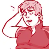
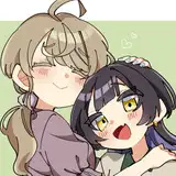
i've also included scrapped panels -- some are nothing more than head circles and body rectangles to figure out placement, but i tried to keep the more complete ones here to show how i had to retry some panels repeatedly. a lot of them are simply not the expression i wanted... shrug emoji. jessie can't look incensed in one panel and then say she IS calm in the next. i wanted her to be genuinely not very worked up, just rude and abrasive.
it's a lot of headshots, but i WAS at least not trying to phone it in. it felt like focusing on the expressions of the characters was often the most effective choice. i'm still figuring out shot choice for comedy, because i've primarily only studied drama...
this scene, despite having more dialogue, was shorter than the first scene... it also had fewer words overall, though, at just over 1,000. it would actually be another page shorter, but i have a rule in my mind that scenes should change on page flips except under special circumstances. even numbers are the left side of the book, and odd pages are the right side, then it's a page flip to the next even number. i don't scenes should start on an odd number (i think i might have also explained this numbering system in the last update).
some of the pages have structural issues that i still need to iron out, but i'm not going to sit there the next page depends on what happened on the previous page, so changing any page can cause a domino effect. we shall see, though. page 12 (first page of the scene) has too many panels forced into the bottom because the pacing was really odd when i split it up a different way -- the next image is the initial layout i had for the page. with a 4-panel hold on an expression sequence, there wasn't really an elegant way to break up the last chunk of this page. i have ideas... but i'll need to try them at a later date. they all work, there are just drawbacks for each choice.
page 16 ("the STORY, obviously" page) also has a really obvious structural issue: there are 2 panels on the left side of one big panel, interrupting left-to-right reading order. i usually am fine with this IF the reading order doesn't matter, but it does here. she doesn't recall that conrad is new here and THEN look him up and down. the two panels on the left were originally in the above row to the right of the first panel, and my stupid ass moved them to the second row without realizing the critical error i was making.
the next row is one singular panel that's too big to share a row with the conrad panel. i could break up the double figure of jessie there, but i put them in the same panel for the interruption effect and a communication of more rapid speed in the exchange between jessie and mark... that in and of itself needs composition adjustments to deliver the visual gag better, but i didn't want to fix it when i did not even know if the panel, and the gag, would be staying in this page.
there wasn't quite enough space for the speech bubble with the doublet panels in the first row, and widening the first panel of the page meant there was no longer room for the doublet. i can move it back up, but then there is just a row with a huge amount of empty space with just one small panel of a bust shot, lol.
the most likely solution for that page is resizing and redrawing the doublet panels to split them between the first and second rows, but i had made them small to add variety so that it wasn't JUST same size headshot, same size headshot, same size headshot... etc. i don't know if it's just my brain, but constructing comics is already complicated, and at least a dozen times more complicated when i can't just Make The Canvas Larger to give myself more space. i had already spent an extra day just trying to fix the structure of page 16, so i let it go for the time being and moved on.
the changes in dialogue were tweaks for effect, such as having characters mention other characters' names because they aren't ever mentioned anywhere else, or changing bull to bully sticks/sorry to sorby for something more novel and amusing. "meant" was "supposed" before -- the word was too long and it made it a pain to get the speech bubbles looking clean and readable.
anyway. i think that's all i have to say about this scene's process. i worked on lining the page i'd tested colors on for print, but i'm taking it slow because of how hard i press on the tablet to get the lines right... it turns out the screen on my tablet stopped working at some point. i haven't used the screen in like, 2 years, so i didn't notice.