hi again, everyone. i finished sketching scene 3. additionally, i finished lining and coloring the test page to figure out how i wanted to go about drawing this for print... i also reviewed scenes 1 and 2 and wrote a lot of notes about what i thought was good and bad, for revisions to the sketches. so there's, like, a lot here all at once.
first is all of scene 3's sketch. i ended up ending this on the wrong page, an even page number, so the next scene wouldn't begin on a page flip. i will probably just prolong the ending deliberation of the last page with jessie looking at the pen or something to get it to where it needs to be. i don't like the idea of starting the next scene on the adjacent page because i wanted to do another match cut.
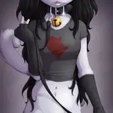
before all of that, i had to finally design her bedroom. i had a vague idea of where i wanted most of the furniture to be placed, but it's always more complicated in practice. i didn't bother picking colors for them, since the colors of the comic will be changing constantly. filling out the background with clutter will be challenging. i have to wonder how much bg details will end up inconsistent across the digital and print versions...
after the room design we have images of the prints that i did... the tif that i saved printed in wildly inaccurate colors AND printed all blurry for reasons i can't figure out. several other files in addition to the raw CMYK test printed out absolutely fine. tif is supposed to be a lossless file-type, so... What The Fuck.
regardless, it showed me that the colors i'm using aren't as vibrant as they can be. i want that more vibrant pink... i had also printed an upscaled version of the digital colors page, and the colors on it were also more vibrant. i think i will eventually round this down to a large palette of bright colors that i typically desire, which i'll cycle through. it'll save me time and let me know what to expect from prints without constantly paying for tests (0.50 per page, but it adds up to A Coffee or something relatively quickly).
the first two photos are comparing the raw CMYK png with the tif colors. the photo after that is a comparison of the upscaled digital version printed out, and the linework of the redrawn print version. the colors are duller, but that'll get fixed to some degree. the image after that is showing a test of a subtle ben day dot texture i wanted to try out, and maybe a subtle multiply layer offset from the lineart... the detail lines would need to be removed from that, but i'm lukewarm about it anyway. here were a couple other ways i Tried to incorporate the ben day dots:


then after that, there's just a side-by-side comparison of the digital file and print file with the colors changed to match the digital file, so that it has a fighting chance when compared to the digital... i will probably print them once i feel up to going to the library again... it sucks so much to go anywhere now with the masks all the time forever.
last, there are a couple of screenshots of the kinds of notes i took for the previous scenes. there are about 3,000 words between them, so i'm not gonna post all of it. i'm antsy to try coloring more of the comic, but i don't want to finalize scenes i'm not happy with yet.
i will try to go back and do these edits while thumbnailing scene 4... i want to see if thumbnailing eases the burden at all, although it was pretty feasible to finish most of the sketches on a page-per-day basis.