Hello everyone
Here is the process video, file, and brief insights of FIRE UP, my latest illustration. These kinds of articles are often split into two parts: the concept, where I share the idea behind the piece, and the execution, where I explain the technical aspects like shapes, colors, and value choices. I hope you find this useful; have a great read.
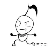
I saw the reference with the matchbox, and my immediate thought was a group of guys ready to engage in a fight, like matches, hot-headed characters. I was not sure what kind of outfit or uniform would make sense for them all to dress the same. I guess, me, coming from a country where baseball is the most popular sport, helped me come to the conclusion that a baseball team about to engage in a fight was the right way to go.

Since the matches look all the same, the uniform of the players will have the same design, colors, and values, so I took comfort in the amount of characters the composition will have in order to balance the lack of costume design. Also, I envisioned each player having a different facial expression, just to make the composition more interesting to look at. The list looked like this:
Before drawing or painting, the gesture for each character was roughly imagined. I pictured the first one pointing with a bat while pushing the secondary character to the back. I tried to make sense with lines first with these two; the third one was my favorite since I wanted him to be happy to fight, something that was a bit unusual but amusing in my mind. I'm not sure if people got it, but I liked it anyway. The first two characters I made them from scratch, no reference for gesture, but the third one I did, as you will see in the process video.

I briefly finished the sketch by adding colors and values. Colors were simpler in order to resemble the match reference, but I took some liberties with values. I decided to use a sunlight source, perfect for white surfaces as shadows can be highly saturated with warm and cold tones. But, what's the explanation behind the colors of this phenomenon?
Sunlight creates shadows with purple and sometimes orange tones due to the scattering of light and the color temperature of the light source. When sunlight illuminates an object, the direct light is typically a warmer tone (yellow-orange) because of the lower color temperature during sunrise and sunset, known as the "golden hour." The shadows appear cooler (purple-blue) in contrast because of the ambient light in the environment.

The ambient light is mainly composed of the sky's blue light, scattered by the atmosphere. When this blue light mixes with the reds and yellows of direct sunlight, it can create various shades, including purples and oranges, depending on the angle of the sun and the surrounding conditions. Additionally, the surface color of objects and the presence of other light sources can influence the perceived color of shadows, making them appear more purple or orange under certain conditions. This interplay of direct and indirect light, combined with atmospheric effects, results in the rich variety of shadow hues we can observe in natural lighting conditions.

Once the sketch was done, I proceeded to clean up line art, refine shapes, and adjust colors and values. Please watch the process video to find the refine phase.
Conclusion
This illustration was relatively simple to develop in concept but a tedious one in terms of execution, due to the number of characters. I've said in the past that I'll try to avoid compositions with more than three characters, regardless of the character simplicity. One day is not enough to finish such a complex piece, or at least, not with the level of detail I like to. But I guess I'm an optimist, and I forget after a while how painful the process is, eventually leading me to choose such a complex thing to create. Enjoy the process video and PSD file.
Thank you for your support!.