Hey everyone!
Here are some insights about the "Hunters" process. Let’s keep it short and consistent.
Concept
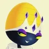
Why did I choose these three pictures? I often save pictures like these and think about how I can make histories out of them. In this case, I thought each picture had something particular, but I could not come up with something interesting to say separately. My solution was to put them together, since they belong to the bird category and they have different visual characteristics. I thought the contrast between shapes, colors, and values would be interesting.
The idea of the hunter was not the first thing that popped into my mind. In principle, due to the small size of the yellow penguin in comparison to the harpy eagle and bearded vulture, I thought a mafia boss and bodyguards dynamic would be obvious. But the gesture was not energetic enough to be compelling.
While sketching the bearded vulture character, I noticed a crazy look direction that perhaps a patient with mental health issues might have had. So instead, I thought of something twisted as well but inclined to medicine. This nurse, doctor, and crazy patient were a more interesting direction, so I started to search for some doctor outfit references (not very interesting IMO).
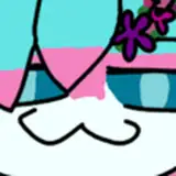
Eventually, while checking nurses' outfits, the nun outfit popped up. It was great since religion addresses several ideas the reference could present, like the mystical vibe the harpy eagle picture had through the eyes, the elegance a nun dress had in relation to the penguin anatomy, and the slightly demonic look the bearded vulture had with the red eyes and pointy feathers. As a side note, the bearded vulture changes color mainly due to its iron-rich diet of bones, which stains its feathers a reddish or rusty color.
It is worth noting, in this case, I focused first on visual contrast but not the story; the story unfolded while exploring shapes.
Shapes
I kept the bodyguard idea at first because in nature, the penguin is still small compared to the others. But I gave each character a different role: the penguin as a striker, the harpy as a priest, and the vulture as the muscle. When making shapes, I think about how each gesture can connect the three characters in some way. I come up with simple short stories that help me find interesting poses. Like, I thought they were in a place hunting something (this was before I came up with the name). They, somehow, already faced some problems, as you can see in the small details like blood or torn clothes. The priest is kind of using his mind powers to suggest where the enemy is. The idea behind this way of thinking is to avoid plain poses or characters that don’t feel alive. Thinking about a situation they all are sharing helps make the characters feel more real.
Colors and Values I had a bit of a struggle here. I assigned one value and color to each character: for the priest, a black value and a very dark, desaturated blue; for the nun, a white value and yellow; and for the muscle, a slightly grey black value with a dark red.
I chose a value or color as a base and created a gradient from top to bottom with a different value or color. This results in an interesting shift from a bright tone to a darker one, creating contrast. After that, I’d play around with these tones or add more values/colors. If I didn’t explain well enough, please check out the process video; it’s clearer there. The goal here is to create interesting and contrasting color and value combinations using no more than three or four different values and colors, keeping it simple and manageable.
Adjustments
I didn’t like how the blue (priest), yellow (nun), and red (muscle) ended up looking together; they didn’t seem to be part of the same scene. So, I spent a few minutes figuring out how to unite them, and Selective Color was the solution.
Usually, in the Selective Color properties, I adjust the whites and somewhat the blacks, but not the neutrals. This is because my compositions are typically dominated by one tone. I might use a variety of that tone to avoid monotony, but this tone is usually the main focus. Changing the neutrals in the selective color properties can shift the whole composition’s tone, altering the overall idea, which isn’t always helpful. However, in this scenario, since all the colors seemed out of tune with each other, it was a different story. Adjusting the neutral colors in the same direction helped merge the composition. I shifted it towards a cooler bluish direction, which aligned well with the original concept’s mood. Feel free to check the PSD to understand this treatment better.
Conclusion
While the process may seem similar in principle, it's the discovery of shapes, combination of colors, and adjustment of filters that make each journey unique. This allows me to understand and develop different ways to capture reality and tell my ideas and stories. I hope this brings some value to you!
Welcome to all new patrons. If you found this article useful, please drop a like or a comment! I appreciate the feedback and also criticism, I want to improve and give you the very best.
For more information, check out our Patreon FAQ: https://ramonn90.myportfolio.com/faq and Patreon Catalogue: https://ramonn90.myportfolio.com/work
Thank you for your support.