Hey everyone,
Some toughts about the process behind "Crime", my last piece.
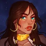
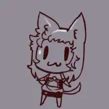
At first, the concept was not very clear for me. I did a brief exploration into shapes to try my luck, but nothing stuck. So I decided to check on fashion references to find a way to combine a white outfit character with a black outfit character. Fortunately, I saved some references of officers and this sparked the idea of making the two of them detectives.
While thinking about the story, I wanted to add a supernatural or dark touch to the situation. That's when the "crime scene" idea came into the composition. Initially, I thought of making one of the characters a phantom, taking notes from the actual phantom victim of the crime, and the other just analyzing the crime scene. However, it was a bit confusing since the original reference only had 2 characters and adding 3 might not make the anthropomorphic interpretation clear enough. So, I decided to stick with the two characters and began with a rough sketch before investing time to refine the concept.
This time I tried a different approach. In the last few pieces, I've found myself feeling disappointed almost at the end of the process, this due to a lack of pre development on each phase of the execution (shapes, colors, values, details), not in detail, but more like a sketchy exploration to avoid pitfalls. So as you can see in the process video, I kind of finished the piece roughly to be sure it was worthy. You might ask what "worthy" means in this context, basically, when I create a piece, I try to cover points of interest, like face expression, gesture, colors, values, mostly composition. When these points meet, I feel confident enough, but I'm too lazy to go through every step of the process quickly so I decide let the process guide me step by step. It's more intuitive that way but risky.
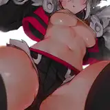
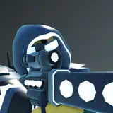
The good thing of "finishing" the piece quickly in a sketchy way this time is that helped me to come up with prompt solutions about small issues like how the ghost character would look like. Ghosts often are transparent, in black background or backgrounds with information it's way more clear to understand they are ghosts because the line or overall shape suggestions are white, and then you can just show what's behind them throughout them. But this time the background was white and there was no objects behind, as I'm choosing to present characters with a character design format (no information behind the character). This was problem number one.
Problem number two was that I wanted to make an all-white character, and the ghost idea was perfect. But at the same time, ghosts don't reflect shadows like a normal body, based on the popular idea of a ghost. So all white with no shadows is basically boring in my opinion; not enough information is a problem. Eventually, I came up with the solution of making the shape of the ghost character fully defined by line information and suggesting busy shadow information at specific points like the arms and chest, but leaving the rest as white and soft as I could, suggesting the idea that the composition of this character was not consistent or solid (Check the PSD to see the layer treatment execution). Also, I made him not touch the floor, just to make the idea even clearer.
You might think the "ghost concept" it's obvious, but sometimes we assume the viewer understands our thought process and they will follow the path of our story the same way we do. But the truth is people are often distracted and they don't pay too much attention to details as much as you think, so it's important to make your idea as clear as you can, especially if the character is way too simple.
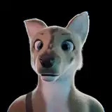
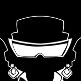
If you're trying to create a character that's too simple, where the color and value are the same throughout, then you need to balance by building recognizable information with whatever your main tool for character design is. If it's the line art, add key information there. If even line art isn't an option, then focus on developing a recognizable shape for the character's silhouette. It doesn't mean "busy" design, but rather something simple and distinctive for memory recognition. Character design for 2D animation is a good reference to study since they often design simple yet memorable characters. The way I solved this was by making my line art more detailed (no problem since I don't plan to animate this later), and also using the crocodile texture of the skin as a point of comparison, along with eyes and mouth design, which are similar to a crocodile as well.
Ask yourself questions like, 'What's the most commonly associated cliché attached to this specific concept or character?' and don't be afraid to use those visual cues in a way that makes your ideas more familiar to the viewers.
Conclusion
People react to what they understand, so the more abstract your idea, the more thought you need to put into translating it for others. This doesn't mean to stay with what everyone knows or what others create, but understanding the symbolism behind visual clues to properly build a path for your audience to read your art.
Welcome to all new patrons. If you found this article useful, please drop a like or a comment! I appreciate the feedback and also criticism, I want to improve and give you the very best.
For more information, check out our Patreon FAQ: https://ramonn90.myportfolio.com/faq and Patreon Catalogue: https://ramonn90.myportfolio.com/work
Thank you for your support.
Ramon Nuñez
2023-10-15 13:26:58 +0000 UTCOlivia Azura
2023-10-15 12:14:26 +0000 UTC