Hey everyone!
In concept art presentation, as well as narrative driven art (illustration, animation, films, comics), making realistic and interesting environments can be tough. The problem usually comes from not knowing some basic environment design principles. Even though I mostly do character design, knowing how to make good backgrounds is really important for telling stories in any art oriented goal. If you've been having trouble with making your background compositions, environments, or landscapes, this article is for you.
Solution
First things first, in today's article we'll tackle the fundamentals of environment design. Instead of overwhelming you with theory you pretty much can find anywhere, I'll describe the fundamental functions as if we were creating a simple environment using my creative process which consists of shapes, color, values, this time we will put values before colors, I'll explain later why. So, shapes, values, colors.
You might wonder, but how will the process be the same if the end result is different? Think in this way, what we do with characters is shape building, then colors and values but focused on human anatomy (gesture, expression, costume). For the environment, it's shape building as well but focused on props or physical spaces, not humans only. Therefore, what we need to understand is how each phase of my creative process (shapes, values, colors) adapts to a different end. Let's start with shapes.
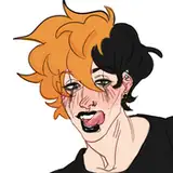
For character design and characters on illustrations, during the shape creation phase, I tend to focus on gesture, body proportion, expression, and other shapes that might be part of the character like props for instance. Often I define the horizontal line by choosing from what point of view I want to present my character, if I want to show my character from top view the horizontal line is closer to the top of the canvas, if I want to show my character from below the line it's near the bottom of the canvas. I do this organically and from that point, I start to build, often with two points of perspective in mind, if you want to understand more about this, check this article about 6 fundamentals of perspective in my work.
For the environment, it's the same, we will focus on setting the first fundamental which is perspective, here is a simple explanation. The fundamentals of perspective are pivotal as they provide a structured way to depict a three-dimensional space on a two-dimensional plane, ensuring a realistic and believable representation of space and depth. Understanding this principle allows artists to accurately depict the relative size, distance, and position of objects, thereby offering viewers a coherent and immersive visual experience. Through techniques like one-point, two-point, or three-point perspective, artists can create interesting environments that abide by the natural laws of vision and spatial orientation, forming a crucial foundation for successful environment design.
Setting perspective first in environment design helps make sure everything looks right and fits together well in the scene. It avoids problems like objects appearing too big or small, or closer or farther than they should be. Without the right perspective, the scene can look off, confusing, or unrealistic, making it hard for viewers to connect with or understand the environment you're creating. It's like laying down the basic rules for your drawing, so everything that comes after follows these rules and looks good together. So how do we do this?
Ask yourself, where do you want the horizon line to be? As a tip, I recommend placing the horizon line off-center in order to create a more dynamic and visually interesting composition. It prevents the image from being split into two equal halves, which can feel static or boring.
After choosing where your horizon line will be, add points of perspective, I often use two points but briefly here is where each is often commonly used and why:
You can chose the brush called "Perspective Point" to set these two. Once setting your perspective, you now will have a three dimentional guide for the objects you plan to put in your composition.
You don't know what to put in? This phase is often part of the conceptual exploration, since we are focusing on technical execution in this article I'll not go further in details, but if you are familiar with my process you will notice I spend some time thinking, figuring out what would be the concept of my pieces and during this phase stories come in, providing the necessary context for visual information to exist. When creating environments the case is the same, before even thinking of opening the canvas, ask questions about what is this piece about, no need to answer them all, as often during the process new ideas spark but answer enough questions at least to understand briefly what the direction is.
Depending on the context of your goal, your composition would be filled up with objects/props that will follow the perspective points as a rule for their three-dimensional position. Scale and composition are fundamental in environment design as they guide the viewer's eye and establish a scene's realism. Scale ensures that objects relate to each other in a believable manner, maintaining consistency in size and distance, which is crucial for viewer immersion. Composition, on the other hand, is about arranging elements harmoniously, guiding the viewer's focus to important parts of the scene, and evoking desired emotions. Poor composition can lead to cluttered or unengaging scenes, while incorrect scale can shatter the illusion of reality. Together, they form the backbone of effective environment design, creating visually appealing and coherent scenes.
Setting scale and composition first helps make sure everything looks right and well-arranged from the start. It avoids problems like things looking too big or small, or scenes feeling messy or confusing. It's like planning how a room should look before you start moving furniture around. Without the right scale and composition, the design can look off and not tell the story or give the feeling you want.
If you already know what these objects are gonna be and still do not know how to draw them because they look different or complex in shape, simplify them into simple geometric shapes, perhaps use cubes to represent every object. These cubes will follow the lines made by the perspective points, you can after develop more in details the objects inside each cube if you find this particular task too easy.
These fundamentals (perspective, scale, and composition) are useful during the shape-building phase, you will set guides and build shapes based on those guides, now let's dive in into the next step.
Often after shapes are defined I'll recommend moving forward with black and white values to define how light suggests depth, objects' volume, and textures. Why no colors first? This is just a personal recommendation as I find it easy to understand values when colors don't distract me. Feel free to try differently, remember part of the creative process is very subjective.
Values, referring to the range of light to dark, are crucial in environment design as they help depict depth, object forms, and textures effectively. They create a sense of distance; lighter values often come forward while darker recede, helping to establish a believable space. Values also define the form of objects, showing how light interacts with surfaces, thus making them appear three-dimensional. Moreover, they help illustrate different textures, aiding in distinguishing between materials, like the roughness of a rock or the smoothness of water. Without accurate value usage, environments can lack depth, objects may appear flat, and textures might not be convincing, leading to a less engaging or realistic design.
If you want to study this fundamental in depth, turn references into black and white and notice how values behave depending on the light, shapes' distances, and shapes' textures, this will give you context when building similar or original compositions with values.
Colors in compositions, as the same with characters, serve as a guidance for evoking feelings depending on the combination, but beyond that, colors in the environment are subject to constraints defined during the values phase.
When values are applied to colors, they alter the perception of those colors and their interaction with other colors in the scene. For instance:
Understanding how colors, along with their saturation levels, affect the design helps in creating a visually coherent and appealing environment, serving the narrative and enhancing realism.
As a last tip, I recommend you to approach colors and values the same way I do with characters, choose one value to dominate in your composition (white or black), desaturated tones, one color as a main protagonist and a secondary to create contrast and attention, if you find yourself comfortable once executed those choices feel free to dive in into more complex color and values decisions.
.
Here are three exercises that might help you grasp this concept better.
1. Open a canvas, choose the horizontal line, add two perspective points (Perspective Point Brush) and fill up the composition with cubes that will follow the perspective points, you don't need to think what these boxes mean, but mostly this exercise is for you to be familiar with the execution of shapes in environment with perspective in the simplest way possible.
2. If you feel confident, choose to represent a reference using this same technique, not details, but cubes, as if you are turning every object of your reference into a cube. If you need more references to study, focus on topics like films, pictures from photographers or even environment concept art portfolios, just for you to have a sense on how these are composed.
3. If you don't want to work from scratch or just make cubes in a white canvas, maybe choose one of those references, spot the horizontal line, the perspective points, and create cubes around the objects that meet the lines created by the perspective points, during this case the perspective point brush is very useful as well. After, turn the layer of the ref off and see how you simplified this composition in order to understand it and later replicate it, perhaps not copying every shape of the composition but the horizontal line and perspective.
Here are some places where you can find more references.
Films: shotdeck.com
ShotDeck is a curated library of high resolution movie stills categorized by various criteria including composition, film genre, and lighting. It's a great resource to study film compositions.
Real Pictures Made by Photographers: flickr.com
Explore the 'Explore' section or search by specific tags to find high-quality photographs. You can also look into specific photography groups dedicated to composition.
Environment Concept Art Portfolios: artstation.com
Search for "environment concept art" or similar keywords in the search bar, and filter the results under the “Projects” category to find portfolios of environment concept artists.
Pinterest or personal pictures
I often find all my references on Pinterest but feel free to use any platform or even your own personal pictures!.
Conclusion
Perhaps all this information might feel intimidating but this is mostly me translating something you already know into a different format. In simple terms, environment design is creating shapes into three dimensional spaces with different values and colors, the goal can vary from idea presentation (concept art) to narrative (illustration, animations, films, comics) but the fundamentals are the same on all those ends. My goal is for you to turn complex reality into simple understandable rules so then you can reshape anything you want under understandable visuals, to tell your stories or just simply make that extra buck. Stay around as I explore more about this subject in the future.
Tomorrow, I'll be sharing the process video of this piece along with the files and insights. They will be available for Mastering Maestro tier and above. Feel free to upgrade if you want more insights about my work.
Welcome to all new patrons! Feel free to drop any questions here in the comments, via DMs on Patreon, or in our Discord group. I'll be more than happy to answer and track your progress.
If you found this article useful, please drop a like or a comment! I appreciate the feedback and criticism as well, as I strive to improve and provide you with the best content.
For more information, check out our Patreon FAQ: https://ramonn90.myportfolio.com/faq and Patreon Catalogue: https://ramonn90.myportfolio.com/work
Your support makes this content possible! Thank you.