Hey everyone!
So here is briefly the process behind "Gatcha".
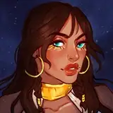
I've been getting inspired by several artists about this "angel" specific subject. It's often an angel doing casual things, and since I've not touched this subject, I thought it would be a good time to try. The problem was, I did not have any particular reference to get inspired from.
This time I chose to mix two different references instead of just one picture. Using one picture usually gives me a clear story, which means less freedom but an easier execution. People get it because the illustration and the story in the reference match. But when I use multiple pictures, things can get messy. I might think it makes sense, but not everyone might get it. So my solution was to stay as simple as I could, and look how complex the composition ended up. I'm telling you, sometimes not having limits is a problem.
Anyways, in principle, it came up like two partners doing a job. It was supposed to be an angel with death, not a demon. Then I was thinking of a situation in which they both can be acting casually, or interact in some way. My solution was to make the angel a cop, and it was arresting death for maybe killing people too fast? I don't know, it didn't fit. So I changed the subject from death to a casual demon, and the story made more sense. It fit better as an opposite of the angel motif, and also, the outfit resembled the cat picture I was using as a reference.
Since I really liked the idea in theory, instead of painting shapes and going for the drawing, first, I spent some time checking for police officer outfits and punk outfits. After that, the execution was pretty straightforward for the first half. I even added shadows in the sketch. As I've mentioned in the last posts, this is kind of a good idea, making a quick sketch adding not only shapes, but good enough line art, colors, and values and then moving forward with cleaning. The 30min challenge on Discord might be a great way to build this "fast execution".
Nevertheless, I spent a solid 6 hours. I was a bit angry at the end as I thought this time would be way faster. I should start splitting executions into two days, so I can have a 3-hour window maximum. It's not smart sitting for 10 hours straight. Yes, the execution lasted about 6 hours, but keep in mind the time I spent researching pre execution.
If you ask me what's best to take out of this process, or processes lately, it's the very first half. In there, you can see the rough idea. The process after is mostly my personal way to clean each phase (shapes, colors, values) and it's highly probable you'll develop your own way of cleaning and maybe spend even more time on details. But the initial presentation of the idea embodies the essence of your composition.. The question is, how can you come up with a similar execution? Here are three ideas.
- Shapes: Make clear the face expression. You don't need to have a pretty face or symmetric features, just define the intention of your character through simple lines; remember you can refine later. For the body, focus on anatomy, not costume. Again, same as the face, not perfect anatomy but seek to capture the gesture and cover at least roughly the shape of the silhouette as this might be necessary to create the blocking shape in which colors and values will be in.
- Colors: Define skin and colors in eyes and mouth. I find faces particularly important. For the rest, just pick one variation of white or black. By variation, I mean not 100% white or black, but a bit darker white or grayer black. Choose one color as a companion of tone. Select specific spots for this color to exist. Ideally, this new color should cover less space than the one you chose at the beginning, but you can shift protagonism. The point is not to have a 50/50 split. I find it interesting to see one being dominant. Think of a Fibonacci sequence. If you want to add more colors in, make them take up less and less space, so it doesn't become too saturated. You can refine after.
- Values: This is an old one but I think works just fine. Pick one side of your character, like left for instance, and all that side will be in shadow. On a new layer, in multiply, with the brush "Limberto - Hard Shapes", make a giant stroke just on the left side. You can also just use the "Rectangular Marquee Tool" and paint with the "Paint Bucket Tool" on that side. After, depending on the altitude of the light, erase parts of the shadows based on the shapes and their volume. If this is too complex to understand, take a look at minute 5:19:00 in the process video and you will see how I applied this shadow technique on the right side of the demon character.
Conclusion
I've always been an impatient person. I think that helped me in a way to come up with quick solutions. In today's post, I've come up with three I often use. They capture what is essential and this releases tension out of the process. I hope it works for you as well. Don't forget to check the PSD!.
Welcome to all new patrons. If you found this article useful, please drop a like or a comment! I appreciate the feedback and also criticism, I want to improve and give you the very best.
For more information, check out our Patreon FAQ: https://ramonn90.myportfolio.com/faq and Patreon Catalogue: https://ramonn90.myportfolio.com/work
Thank you for your support.