3 Fundamentals of My Art Style Illustrations - Bet Video Process + PSD File
Added 2023-11-01 17:02:40 +0000 UTCHey everyone!
Some thoughts about the process of "Bet".
Concept
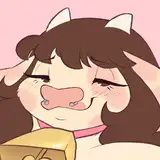
So, as always I thought this would be a quick one, as you can see in the video (6h) it was not. It was around 8h or more including the time I spent thinking before even opening Photoshop. The reference appears to me "two friends in the search for adventure" but this was not very visually attractive for me. So I wrote down a set of goals for this composition based on the reference in order to make a quick analysis. It looked like this:
- Reference Energy/Vibe: anthropomorphic translation from the reference aspects into character's gesture, face expression or body language. At this point, I knew one of them served as "transport" for the other, I just did not know why or what was the reason for this.
- Action: This point aims to justify the gesture inspired by the reference using a simple or complex backstory. It's like a step forward into a more original narrative.
- Costume: This point serves as a way to describe information about the character through outfit or props. In here I also can tell some other stories, often visually related to the reference or the story I defined in point 2 (action).
I'm constantly changing the points I relate to when creating illustrations, but these key points are pretty common among my goals, as they provide a balanced composition structure in which I can cover basic interesting information in principle and then add more details down the line. But knowing this basic structure/formula is not enough, as I was not sure what the backstory of the "action" would be and neither the "costume". During the process, it looked like this:
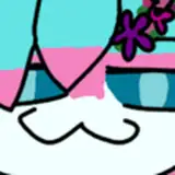
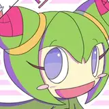
- Ref Energy: Two Friends
- Action: ??
- Costume: ?
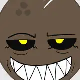
I thought perhaps the frog character would have a tight uniform, like the one Formula 1 pilots have, so in a way I can justify the colors and the thin anatomy, and the beetle character would be like mechanical fixing the pilot vehicle, big black bulk. But this solution was insufficient, as it did not match the reference energy, so I lay on the floor for about one hour imagining situations, like movie shot scenes in which a big character will interact with a thin one.
Then I remembered the reference said something like "tiniest rodeo ever" and the "cowboy" idea came out, I was so obsessed about this mechanic idea because I did not want to put one character on top of the other, it was silly in my opinion, but then I said, why not? I just thought of the most silly thing to justify one character carrying the other, it needed to be small, maybe hurt. Then the "running" idea popped up, yeah they were escaping from something. Escaping from the police by running I think was silly so I thought the next thing would be escaping from bad people, kind of the situation when a negotiation goes wrong. Instead of a negotiation, I thought the "cowboy" topic would fit better with a "casino" theme. This was the last piece of the puzzle. They were escaping from cheating during a bet. The list of goals now looked this way:
- Ref Energy: two friends, rodeo, high energy
- Action: escaping with money, one shot/shot, the other huge carrying him/her
- Costume: Cowboys, Casino, Bet.
Now I was ready to throw some lines.
Execution
I was not sure which angle or perspective would address my goals, so I made the first one that crossed my mind, both characters running to the front, leaving the chaos behind. Because I was not sure, I made very quick shapes and lines so I could move forward into different views in case this was not good enough. Luckily, I kind of liked it in the first place, so I decided to move forward into shape and line art refinement.
If you speed up to the middle of the process, you will see the painting "done" in a sketchy render. I was decided to keep the line art very messy, but in a way, I thought I would regret if I don't do my best, so I put in some extra effort to have a clean and more sharp line art but still aware of not erasing many of the original lines of the sketch.
Shadows were a pretty straightforward process, but my pain this time were colors. I could not decide towards what colors this palette would be oriented, as you know I often pick one tone, but it was tricky, the beetle was black and purple, the frog orange and green. Orange was necessary as it was a very strong and characteristic color in the reference, but the complementary of orange is not green, it's purple, so the solution was to make that frog green very clear and desaturated, as a contrast of the black beetle tone, balancing the hues. I'm describing to you the issue and solution perfectly in this text, but during the process, I was not even aware of this as I often lost myself during the execution and just made intuitive decisions. It's when I found myself stuck for one hour or two when I started to ask questions and think.
I made quite a lot of corrections with filters and value tones, just to push this "green/orange" palette as you will see in the PSD and Video. I believe I did a pretty decent job finding a balance but this is one of those cases in which I can keep making adjustments for hours and hours.
Conclusion
My process of coming up with stories like this and execution solutions is not always straightforward or repetitive, but using words to remember and describe what I did does bring some clarity to my chaos, and in this clarity, I try to provide you with some order, with the hope you can catch some solutions for your issues as well. I hope it helps.
Welcome to all new patrons. If you found this article useful, please drop a like or a comment! I appreciate the feedback and also criticism, I want to improve and give you the very best.
For more information, check out our Patreon FAQ: https://ramonn90.myportfolio.com/faq and Patreon Catalogue: https://ramonn90.myportfolio.com/work
Thank you for your support.