How I Paint Multiple Characters in One Illustration - PSD File + Process Video
Added 2023-11-18 16:50:11 +0000 UTCHey everyone
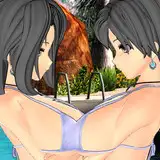
Here is a brief introduction to my process behind "Flock", my latest illustration. The intro is divided in concept development and technical execution, enjoy.
Concept
For this illustration's conceptual exploration, the focus wasn't on creating a story or scene from an animal reference. Instead, I aimed to design a scene with characters in casual, streetwear outfits. Initially, my research focused on finding an animal picture that met this criteria. Why animals? People often connect with animals, and giving them human traits offers a fresh perspective on familiar subjects. Plus, creating stories from animal references adds an extra layer for the audience to enjoy.
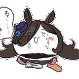
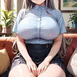
After searching for a few minutes, I found this very popular old picture of pigeons where they look very badass. It fits the vibe and, if there's an animal that can be associated with the street, it's the pigeon.
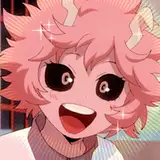
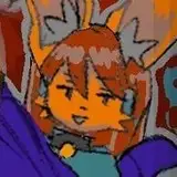
Because I often make anthropomorphic interpretations of all the animals in the reference, I hesitated since there were too many pigeons in this particular reference. So my strategy was asking questions like 'what character will have more space in the composition to be appreciated?' and then I assumed it would be the one in the center. It's easy to assume that the two up front would have a big piece but the truth is, these probably will have complex gestures in which the clothing would not be fully appreciated, so in the hierarchy of information, I will set the character workload this way:
- Center character
- Character on the right
- Character on the left
- Characters in the back (these will have less than 50% of their body shown, and of that percentage, not too much will be complex clothing).
Making complex compositions, in my opinion, is not about putting details everywhere but understanding which points will be more appreciated and leaving the rest as companion or complementary points to support those focal points.
I often recommend creating these kinds of character design illustrations around a scene or situation, but I chose to resemble the reference by having the character 'pose in front of a camera.' I thought it would be fair, as the amount of information in the outfits would make the composition interesting enough.
Since outfits were key in the development of the piece, I did quick research on different outfits. I selected a few and made a simple collage with them in Photoshop as well (you'll see this approach better in the process video). This was to see how they would look combined. I wanted to avoid repetition and achieve contrast in terms of shapes. The easy way to do this is by defining which shapes you want to be different. For instance, for the face, I wanted them to have different hats or hairstyles. I didn't mind too much about different jackets, but these could also be another shape to make different as well.
The list looked like this:
- Reference Vibe: badass pigeons threatening the viewer
- Action: Character posing in a badass way
- Costume (make fabric folds): Jacket, sneakers, hats, urban, streetwear. Different shapes and values, similar colors.
Characters' attitudes:
- Serious
- Crazy
- Angry
- Sexy
- Weird
After clarifying some points on the list, I was ready to move forward with the execution.
Execution
Because the previous research brought plenty of information, the shape design process was fast, a mix of gestures from references and costume silhouettes. Sometimes I like outfits from references but not the model's pose, so I rely on the pre-defined character attitudes to come up with different gestures for the costume.
What's the takeaway from the shape and drawing approach in this process? Mostly, it's about simplifying real outfits from references into different body shapes and gestures, as well as facial expressions and color balance. Many references had varied values and colors. I simplified this by shifting to desaturated tones of grey, purple, blue, and green, combined with black and white. The orange eyes were one of the first color touches; this was the little saturated color that caught my attention when looking at the pigeons.
I spent extra time on shadows for volume in this illustration, but not everywhere—mostly on the pants of the character in the middle and one or two jackets. I chose these points for complex rendering information. Check the video to see what brushes I used. Also, the PSD reveals more about color correction through Photoshop adjustments, which often helps in merging different tones across the composition. However, I must say that keeping the outfit palettes relatively similar made the work less complex.
Conclusion
During the creation of this piece, I was very tired. Initially, I thought that making a composition with many characters would be challenging, but having the goals written down and an execution strategy really helped me solve this puzzle. I hope it can help you too. Thank you for your support.