One Color, One Topic, One Outfit: The Perfect Combination - 'The Gills' Process (PSD + Video)
Added 2023-11-22 17:00:11 +0000 UTCHello everyone,
Here is a brief introduction to my process behind "The Gills", my latest illustration. The intro is divided in concept development and technical execution, enjoy.
Concept
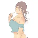
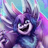
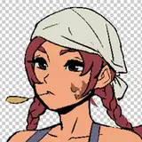
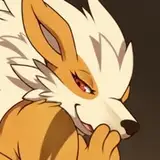
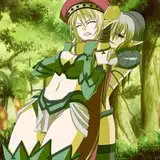
This illustration started with the idea of the color blue. I was uncertain about the reference I would use or the story I would tell; I just wanted to approach the process through color. I checked my animal references and found different sea animals with vibrant combinations of cold tones (blue, green, purple). I decided to pick three with different shapes and patterns but still with a strong blue direction.
The idea of the "guitarist girl" has always been a common theme in my illustrations. It's been a while since I last tried it, with the 'iguana' animation being the most recent. This time, I wanted to try something more ambitious: a rock band. This would allow for a more complex composition and enable me to depict a range of emotions through the band members. I also thought it would be interesting to add an extra layer by incorporating the popular Japanese sailor uniform often found in anime. The structure looked something like this:
- Reference: Sea animals (crayfish, octopus, fish)
- Action: Rockband performing, different personalities (sad, comited/serious, entusiast)
- Costume: Rock/school musician students
With this simple structure I decided to move forward with the execution.
Execution
I started the process with big brush strokes and distinctive body shape gestures, heavily influenced by the animals in the references and some pictures of girls playing instruments, My goal was to create different shapes that could cover much of the composition.
The second step involved using line art to define each character's face expression and shape details. For instance, the pointy shapes of the crayfish were represented in a character's hair, the glasses on the character at the back related to the octopus's eyes and so on.
I must say that 80% of the process involved drawing shapes, as you can see in the video. The color treatment was straightforward from the beginning. Based on the references, I chose one blue for each, made a few gradients using the 'gradient tool' and the soft brush. Then I painted details like the white of the uniform, the red of the scarf, the skin, and patterns the animals had, along with some other small things. In my opinion, it's easier to balance when one color dominates because you can just make variations of the same with brighter or darker values for contrast.
Lighting was a small part of the process as well. I chose one source of light from the top. The most complex spot to render was the tee shirt of the vocalist character (the fish one). I was pretty confident at this point, as I already liked the piece even without fabric render or values in that matter.
Conclusion
If I could pick one word to describe the process of this piece, it would be 'simplicity'. Although the piece is complex in terms of information, the concept was essentially one color, different expressions, and a high school rock band. Try this approach and let me know how it goes! Thank you for your support.
Comments
Hey! Thank your support, is nice to read a comment like this from time to time.
Ramon Nuñez
2023-11-23 09:05:55 +0000 UTCI value your personal thought process as equally as the insights behind your methodology. Thank you for sharing your writing alongside your art, I wish many more artists did what you do!
AJ Touch
2023-11-22 23:51:34 +0000 UTC