Hey everyone
Recently, I received a message from one patron asking about my approach to anime style. Although I'm inspired by anime, I don't have a specific article discussing this topic. So for today's post, I'll share three simple tips for creating characters in this style.
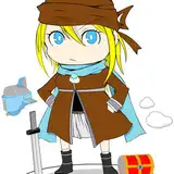
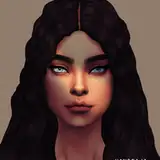
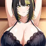
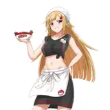
This animation approach, developed by the Japanese industry, is a very distinctive way of making a synthesis from reality. Characters tend to be very simple with accurate anatomy, except for some facial and head features like the size of eyes, head, nose, and mouth. This is done to evoke strong feelings through facial expression, yet it remains simple enough for production purposes. This synthesis also applies to shadows, where values are often a darker version of the base color, flat and with hard edges, again, for simplifying production.
Let's dive into these subjects. I'll split the points into shape, color, value, which is how I often build characters, just for you to have a streamlined execution guide.
If you're familiar with my process, you'll notice I often build shapes with lines or brush strokes. Brush strokes for quick thumbnails and lines for refining shape silhouettes. In this point, we will focus on lines only, specifically anatomy.
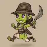
Characters from anime or any animation product share a wide spectrum of anatomy styles, ranging from being strongly realistic, like in 'Ghost In The Shell', to a simpler version, like in 'Pokemon'. Body anatomy tends to keep this resemblance to reality, and what most commonly changes is the amount of information the lines add in shape silhouette.


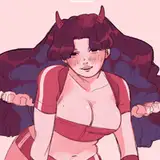
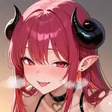
The most distinctive aspects of anime character design are their facial features, where eyes often tend to be the main signature, along with head size and hairstyle. As mentioned previously, this aims to convey emotions through big, expressive eyes and make the character silhouette easy to recognize and memorable with a unique hairstyle shape.
How do we learn this?
The simple answer to approach this type of synthesis from reality is 'Contour Drawing.' This style emphasizes the use of minimal lines to define the silhouette or contours of human figures, often focusing on simplicity and abstraction over detailed realism. Line art is characterized by its economy of line and is often used to capture the essence or character of the subject in a stylized manner.
Exercise: Save a series of human pictures and study them by drawing their contour with lines only. You don't need to focus on the quality of the line; remember, the point is to capture shapes using a few strokes. After a while, you will develop a sense of what kind of lines are best to capture specific shapes. In anime characters, this skill allows you to translate reality into a simple interpretation, what we call 'style.'
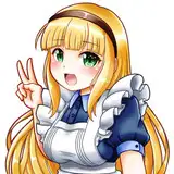
When choosing colors for animation or anime characters, the palette is often defined by the character's context, so there is no particular combination specifically distinctive for 'anime style.' In my opinion, what is commonly found is that the color values are usually bright, as they enhance the visibility of the line. Once shading is integrated into the character, the darker tones match a darker version of the base tone. Saturation might vary depending on the tone of the product, similar to any other sort of production. Bright and vibrant for a younger audience and desaturated, dark for adults.

Tip: When choosing colors for your character, you can keep the tone of the line art black but don't go below 80%; this way, you can evoke a similar look.

Rather than using a range of gradients like in 3D production, anime relies on cel shading technique that simulates lighting on a two-dimensional surface, creating a sense of depth and volume. Cel shading in anime often involves a limited number of shades, typically a base color, a darker shadow color, and a lighter highlight color. As you can see in my illustrations, I often mix 2D cel shading with 3D gradients.
Value shades are often hard-edged rather than softly blended, which adds to the distinctive style. When trying to convey a more realistic approach, often more layers of shade are integrated into the characters, a common practice in older productions but not as much in newer ones.


Exercise: Choose pictures, turn them black and white, and try to build volume with one tone of shade for shadows. You don't need to focus on detailed line art as your main goal is shading, but it is good to have a simple structure made with lines and a few values as a base to distinguish different elements, like skin from hair, skin from clothing, and so on.

This example is complex, so aim for something simpler where you don't need to guess the character's shape, maybe a simple portrait picture can be a good start.
Conclusion
Anime style simplifies key information from reality through lines, colors, and values. What are these 'key' things? In my experience, a good synthesis of shapes using lines, bright colors, and simple shading. It's important to remember that I'm not a professional animator or anime animator in that sense, so take these tips as a starting point but keep researching for insights from professionals in the anime industry. Stay hungry!
.
Tomorrow, I'll be sharing the process video of this piece along with the files and insights. They will be available for Mastering Maestro tier and above. Feel free to upgrade if this tickles your fancy! ;)
Welcome to all new patrons!. Drop any questions here in the comments, via DMs here on Patreon, or in our Discord group. I'll be more than happy to answer and track your progress.
If you found this article useful, please drop a like or a comment! I appreciate the feedback and criticism as well, as I strive to improve and provide you with the best.
For more information, check out our Patreon FAQ: https://ramonn90.myportfolio.com/faq and Patreon Catalogue: https://ramonn90.myportfolio.com/work
Your support makes this content possible! Thank you.
Ramon Nuñez
2023-12-07 09:03:12 +0000 UTCMert oz
2023-12-07 08:49:25 +0000 UTCRamon Nuñez
2023-12-06 09:20:05 +0000 UTCDoge
2023-12-06 00:49:43 +0000 UTC