Hey everyone!,
Here is the process video, file, and brief insights of 'Traffic,' my last illustration. These kinds of articles are often split into two parts: the concept, where I share the idea behind the piece, and the execution, where I explain the technical aspects of the illustration's like shapes, colors, and value choices. I hope you find this useful, have a great read.
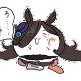
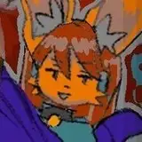
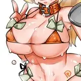
I was not sure what to portray this time, until I saw a very complex traffic light, I believe from Japan. It was interesting to me the possibility of making three characters with different personalities in relation to the function of each light, green inviting to go, red imperative, asking to stop and yellow cautious or in a hurry, as I believe this color announces the shift to red so people need to slow down, but is the case that many times people speed up, this last one was the one that sold me the idea, because I imagine this character being stressed out, kind of funny.
Fun fact
It was curious because in some places of Japan, the green light is blue. It seems to be related to the term for green and blue in Japanese, due to historical language usage where the same word, "ao", was used to describe both blue and green colors. Anyways, I thought this was an unconventional feature.
If you check the beginning of the process video, you will notice that for a while I was working on a different concept, this was inclined towards three-night club workers, red being the security, green the one taking orders and yellow bringing drinks, but while looking for references I did not like too much the amount of information these outfits could have, that's why I switched to a traffic uniform official, with the hat and the equipment. Eventually, I also chose a more simple traffic light as a reference since the one in the beginning was too busy to look at.

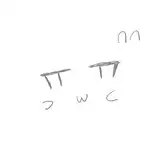
Here is how the list looked like
As I mentioned earlier, in the first few minutes of the video, I was struggling to convey a different idea. Eventually, I changed my mind to the illustration you're currently seeing. This raises an interesting question about the development process: when is the right time to change your mind? To put it simply, it's best during the initial stages of your execution, the quicker, the better. But how? Well, here's how I do it:
This is a process sometimes can be run mentally while searching for resources but nevertheless I recommend finding a quick way to address it in 30min or one hour. Here is an example for this specific process you will find in the video

If you had read any of my previous posts you will know by now this is not a new concept, but the key takeway of this insights is providing more meaning to why this is useful.
The reason why I changed for this specific case was that, I find particularly important to have interesting costume design like fabric folds and accessories. The club idea was interesting in theory but once I moved to step 2 (sketch), I've noticed it was too simple. Leading to a consistent decision, of changing the concept.
My approach to color and value for this piece was focused on balancing very bright values in the characters with a darker background, this with the aim to create certain contrast so the whole piece did not look too simple. Additionally, I chose one big and colorful aspect of each character, which is the hair, to break the outfit the three of them shared. The process can be summarized in a struggle to break uniformity through shapes (face expressions, body gesture, anatomy proportions, hair shape) and colors (hair and uniform small features).
Additionally, the little extra shapes as props and creatures, aim to fulfill any extra lack of information. I understand this concern I have of adding extra info is not always necessary, as I've always liked the "less is more" idea, but I tend to add this amount of information when I consider outfits are not as complex as I'd like to. By complex, I meant full of information in terms of shapes, values, and colors.
.
Conclusion
Many decisions we make while creating art are driven by intuition, such as judging if it's good enough, deciding whether to change the subject, or determining if the background fits. Some days, the process is straightforward, but on those that aren't, having a bit of structure to guide your expectations can be immensely helpful. It not only assists in your intuitive journey but also signals when it might be the right time to change your mind. Thank you so much for your support!