I often share plenty of information about art fundamentals but don't speak enough about my Photoshop Workspace, where I do 100% of my work. So, in today's post, I'll share tips and specifics of how I use this software for you to get the best out of it.
Many of the filters and features of Photoshop can be found in Procreate as well. So, if you are more of an iPad artist, stay tuned.
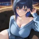
My canvas size is lately 6000x7505 at 300 pixels/inch. The reason behind this is mostly accidental: I chose this size once when I wanted to achieve a thin and cleaner stroke for line art purposes, made by my favorite brush "Pencil Oh - Line Art". Having the canvas this big allows me to keep the brush at a small size (22px) and create line strokes with a soft texture. You can try half this size and see how at 22px the texture is more present in the strokes. This is not bad, but I prefer the other way. Since then, I have kept it that way. If I need to work in smaller sizes, I use "Clean - Line Art," which does not have such a strong texture.

My window arrangement is often for one canvas at the beginning. When I want to address issues using references, I often use the command/control + tab to switch between windows quickly or simply split the Photoshop window into "2-up Vertical". This is particularly useful when doing studies.

The tools I use the most are these:
Magic Wand Tool: to select the section I'll paint using the "Paint Bucket Tool" afterward. This process is very tricky because I often select the outside of the character or object shape and inverse the selection. This is because often inside the character, there are too many small shapes, and it might take too much time to select each one of them. If you ever drew in Paint (the old software of Windows), you would understand this process of using the paint bucket to select shapes enclosed by lines.
Brush Tools (b): As for brushes, of course. I often use the command.
Eraser Tool (e): For errase. I often use the comand
Paint Bucket Tool (g): Often for blocking big shapes, like the whole character silhouette.
Zoom Tool: to zoom in on details. I often use the key "Option" on Mac and scroll with the mouse.

As you might know by now, I use 8 brushes from my set, plus more than 400 I've collected over the years with particular textures. The 8 ones are named each based on its function and are listed this way:
Pencil Oh - Line Art
Clean - Line Art
Limberto - Hard Shapes
Hard Shapes
Soft Shapes
Soft Texture Shapes
Soft Pixel Shapes
Perspective Point

If you have seen a process video in which I use another brush that's not from this list, just let me know which one it is, and I'll tell you where I found it so you can get it as well!
The most common layer type I use is normal, and on top of those, as for blending modes are:
Multiply: for shadows.
Color Burn: for soft shadows right on the edge that separates illuminated areas from shadows. Learn more about this in the article, "Render Tutorial? Hellyeah! How to Shadow/Light/Values/Volume/3D/Paint".
Overlay: for layers I want to use for color saturation in illuminated spots.
Screen: for creating soft light on top of the whole composition.
Color Dodge: for subtle light effects with saturation.
People love the filters I use that convey a cinematic aesthetic. Here are some:
Selective Color: When I'm almost done with the piece, I do adjustments on the whites, neutrals, and blacks tones, seeking a bit of saturation. This helps to build a mood or light tonality that merges all the colors that might be too different. Sometimes I also play with one or two colors besides the three values mentioned.

Smart Sharpen: This creates a small bright contour around shapes. This creates the illusion of a line more thin or just sharp. I merge all the layers and apply this filter on top at the end of my process.

Pixelate/Color Halftone: Recently, I've been using this filter on top of a copy of the smart sharpen layer. This copy, I change to a soft light blending mode, turn off the R channel, and turn down the opacity to 24%. This creates a subtle texture on top of the art, similar to a TV effect or comics-like print.

These are some of the most used adjustments and filters, but I do have quite a few more.
Last but not least, the export. Currently, I'm using "Export As," and regardless of the size of the canvas, I often change the longest side and reduce those pixels to 1920. This is basically because I share most of my art digitally on social media, and a bigger size will change little of the resolution. I used to be obsessive with this a long time ago, but I've noticed that many of the details go unnoticed by the audience. That's why I emphasize simple big shapes, as these are the ones everyone catches at first sight. I'm currently exporting in PNG format.

Conclusion
You can delve into my files by checking the Mastering Maestro tier, where you will find 6 months of posts full of specifics about this. There is so much to share and so little time, but if you have any doubts, drop a comment or just simply DM me. I'm here to help! Thank you for your support.
.
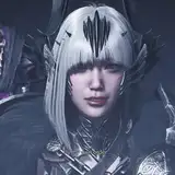
Tomorrow, I'll be sharing the process video of this piece along with the files and insights. They will be available for Mastering Maestro tier and above. Feel free to upgrade if you want more insights about my work.
Welcome to all new patrons! Feel free to drop any questions here in the comments, via DMs on Patreon, or in our Discord group. I'll be more than happy to answer and track your progress.
For more information, check out our Patreon FAQ: https://ramonn90.myportfolio.com/faq and Patreon Catalogue: https://ramonn90.myportfolio.com/work
Thank you for your support.
Vani
2024-09-02 21:26:42 +0000 UTCRamon Nuñez
2024-04-04 09:45:45 +0000 UTCDulat
2024-03-30 08:27:40 +0000 UTC