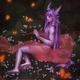
Colors and values are key steps in my art execution, but I often speak about them separately. In this topic, I'll specifically show you how I color shadows and other values on different spots of a character. Let's dive into coloring.
.
Once I finish the line art and block the character's silhouette, I choose a simple palette of three or four color tones to apply to the different parts of the character. After that, in a new layer on top, I add shadows using one desaturated color. Sometimes I don't change the tone of this shadow regardless of the surface color, but other times I adjust not only the color but also the brightness and darkness of the tone value to differentiate the materials of the character, for instance, the shadow on the skin and the shadow on the cloth might have different colors and values.

Let's break down this application into points defined by the base color and value.
To understand this application simply, let's use the HSB slider of Photoshop as a guide and split the categories into three: white or bright color values, mid color values, and black or dark color values.

By 'value colors,' I mean that if you turn the canvas black and white, some colors will have a bright value, some a 'middle' grey, and some a dark value, as in the example below.

If the base color is white, I often use a brighter shadow with cold colors, like blue or purple, especially if it's for cloth or non-skin tones. For skin shadows, the exception is that the shadows are warm depending on the saturation.

If the base color is not white but still bright, I often use a medium tone of the same color as the shadow, just to set the contrast with a darker and saturated version of the base color and value.

Neither too bright nor too dark, the values for these base colors are in the middle of the HSB Slider. Since my style is very inspired by 2D animation and anime, my base colors are often bright. So, when I rarely use mid colors, it's because I plan to use saturated colors as the base, or I want to paint a bright version of a black surface.


It's very rare for me to use black or dark base colors, but when I do, I try to leave some room for an almost black and desaturated shadow.

The saturation of the shadow color might change depending on the vibrancy you want the piece to have, but I generally choose a desaturated approach for the overall composition, opting to saturate only one color.
As a quick tip, you can set a different mood if the tone of your shadow differs from the base tone. For instance, using a bluish shadow on a warm base tone might make the character look odd, yet it makes sense when there is a cold light source.
I hope this helps!. Thank you for your support.