Hey everyone, here are some thoughts about each process:
1. The reason I painted this dessert was because I liked the values, the smooth combination of yellows from the dessert itself, the cream, and the cherry that had a small highlight reflection that broke the smoothness. Plus, the strong contrast between the values in the metal was very attractive and interesting to play with using different brushes.

2. Similar to the previous example, I liked the contrast between the strong values on the rock in relation to the smooth values of the water. Now that I’ve noticed, both practices, although very different, share this reflection and values combination.

3. What I liked most about this picture was the movement between the two fencers. For this type of practice, I often like to make shapes very distinctive using line art, so I can push them later, exaggerating or distorting their overall shape silhouette. Finally, some small touches of watercolor to capture those values from the original pic. I like the shadows on white surfaces; they have a great range of subtle colors.

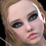
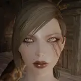
4. A portrait drawing so as not to lose the habit of drawing suffering faces.

5. City! Those are always so intricate and full of detail. Painting a city is a challenge if you have little time and don’t like detailed challenges in composition. I didn’t have time and don’t like details like that, but hey, I figured it was time to try one of those. Plus, I wanted to make it feel very sublime by using texture brushes. It wasn’t a photorealistic end I was aiming for, but the lights.

6. What I liked most about the goose reference was the look the animal had. It felt a bit pretentious, and although the original reference didn’t have such an extreme shape silhouette, I thought making it a bit more simple and curved would boost the energy in the practice. I’m not sure why, but clean curved lines often strike me as dynamic and fast. I guess it’s because I often make those strokes quickly to keep them clean.

7. The egg was an exercise for me to be okay with very simple themes. In the future, I’d like my art to be a bit more iconic and simple to remember. This, I assume, requires practice, and perhaps these kinds of challenges will lead me in that direction to some degree.

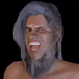
8. Ralph Fiennes portrait: I often don’t like making art about celebrities, not because I don’t like them, but because I feel it’s a distraction from the artwork execution, and these practices are mostly about that. Nevertheless, I like painting profile portraits, and this one had pretty good values to play around with.

9. In tune with the egg practice, this little key practice was done because I found the inscription funny. In the original reference, it’s a bit longer, but I figured shortening the text wouldn’t change the message.

Process Video: https://youtu.be/DvUXIGlnHuI
Enjoy the files and thank you so much for your support.