Hey everyone, here are some brief insights about the motivation behind my latest practices.
1. What struck me from the first picture was the contrast and textures in the trees created by the sunlight. I figure this would be a nice picture to be captured throughout very strong shape textures. The more I dive into my studies of traditional paintings, the more I feel inclined to use brushstrokes to suggest shapes, but in a very rough way, almost vague, where I put trust in the viewer’s ability to come up with the rest of the shape and stroke suggestions through light, which I find interesting.

2. On that same page, I chose a different subject—a cat—whose body shape would be clearly defined not in small shapes but in big ones, along with the volume of its body within the body shape silhouette, painted through textures. These textures are clean, not like paintings that replicate oils, watercolors, or acrylics, but digital strokes. This mix, I believe, creates a sort of unconventional way to portray reality, still messy but with enough order behind so the viewer can spot the volume. Brushwork contrast was balanced by making the back almost flat while the front of the cat had plenty of different values.

3. I tend to paint compositions with strong contrast, yet this one was almost midtones all over. I think I was trying to get a wide range of colors, not only in the mud but very slightly in the water. During the process, I struggled because I was not able to feel comfortable with the end result, mostly because I had too much information all over the canvas—something I did not notice until the end. When I decided to leave the water with variations of blue tones, but with no contrast in value like in the mud, this felt more harmonious, in my opinion.

4. I think what I liked the most about the statue of "Ugolino and His Sons" was the ribs, along with the gesture of the child. If you go and see the statue from different angles, you will notice the mastery behind each gesture—so expressive and organic. I've secretly been saving statue references because deep inside I know, before dying, I'll try that kind of art.

5. The cemetery, dark and simple, when I saw the reference I painted it in my head; it was very straightforward regarding the amount of decisions I would make. This is an interesting phenomenon that I think everyone has when they're exposed to a certain kind of information or habit; you tend to see the world through those lenses. So, in this case, for example, I look at references and I can imagine how it is constructed using my technique. This, besides the fact that I liked the picture, brings motivation for me to try.

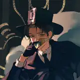
6. The roster man was an old reference I wanted to use for character design but did not happen. I wondered if I could create this practice without the use of lines but with brushstrokes, similar to the cat in the first picture. Although I'm not actively studying impressionism, I've been inclined towards that direction recently, but in search of making things simple without them looking flat, this is a challenge.

7. To paint without clear guidelines or drawing, I think, puts a lot of weight into the volume of the practice/painting—no lines and flat volumes, and I think it's a no. I believe it's possible through the use of colors to come up with volume in which the information is presented, whether in the shadow spots of the composition or in the light, but not in both. For example, in the meat practice, most of the contrast in values and colors was in the "fat" part of the meat, while the muscle—the red one—had way less information. I'll try to explore more into this idea next post; stay around.

Process Video: https://youtu.be/LiC6OgnALtw
Thank you for your support