Hey everyone, briefly, here’s why I painted these practices.
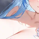
What I liked about this reference was the atmosphere created by the light and blue palette, and how it contrasted with the warm light in the ship. I felt I could use textured brushes to suggest complex shapes without spending too much time on details—especially in areas where values, hues, and colours blend.

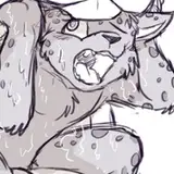
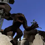
I was captivated by the width of the gorilla’s mouth while yawning. Since I like to push shapes in gesture, I thought this would be a nice picture to try out. For watercolour textures, I often make two or more attempts to get the values and colour definition right. The first one is a test, to come up with a similar look—but the problem is that I tend to use too many brushstrokes, too much texture layered over itself. Once I get an idea of what I like, I try to replicate that same attempt with as few strokes as possible. I like watercolour texture when the number of strokes is minimal; it makes the painting feel simple yet complex.

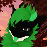
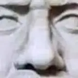
I went with a bit of my general approach here. I didn’t want to use any sharp edges for the big shapes, just a more textured style. This is something I often see in traditional paintings, and I guess I wanted to understand how to create that rusty, crispy look. What I focused on most was finding the right combination of dark and bright values so that spots like the nose and eyes were distinctive enough. Often in these practices, I like to have a few spots more rendered to balance the messiness of the rest of the composition.

I had a little time and wanted to do an extra practice, so why not try painting a very complex composition in the shortest time possible? I think I spent roughly one hour. I wasn’t aiming for perfect details—just to capture the picture with the right amount of strokes.

I liked the composition of the mountains, the values, and the colours. This picture is one of those that doesn’t quite seem real, but what I liked most was that I could visualise, step by step, how I would paint it. I think that’s because I already knew which brushes I’d use for most shapes—sharp, clean ones for the mountain silhouette; textured ones for the white snow and dark rock tones; and finally a mix of soft and hard-edged brushes for the shadows.

In this picture, I liked the contrast and the colours—nothing like good rim light to catch your attention. Also, on some days, I try to see how much I can get away with using quick execution—translating complex references into a series of strokes or textures that are understandable at first glance, yet chaotic under closer analysis.

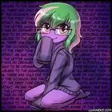
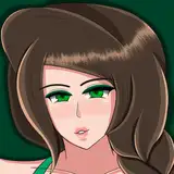
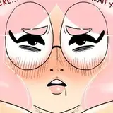
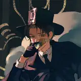
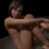
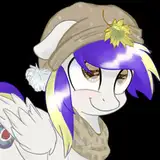
Lastly, this reference represented beauty and tragedy at the same time. I think that kind of combination is what I’m drawn to. I also felt I could create a wide range of colours within the skin—something I’ve been chasing more and more without even noticing through my practice.

Process Video: https://youtu.be/ActZ89Mkn20
Thank you for your support.