Hey! Process and thoughts “a continuación”:
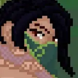
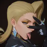
1. I wanted to make a drawing out of that hypo picture, mostly because I liked the curves in the anatomy and the values. I thought interpreting it through textured brushes would be beautiful—so why not? I apologise for forgetting to hit “record” while adding values, but I hope what I could record still makes some sense.

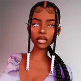
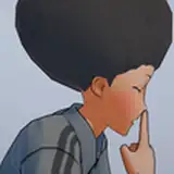
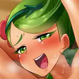
2. It’s been a while since I did a facial expression study using references. It’s a tricky business, considering each face needs to look the same to some degree, at least anatomically. The way I approach this challenge isn’t by copying every single shape exactly, but by focusing on the shape, spacing, and position of the eyes in relation to the nose and mouth. That way, the face stays relatively consistent regardless of the expression or perspective. It’s difficult. If you want to learn this, I’d recommend focusing only on line art at first. If your drawings all look like the same person, then you can move on to other aspects like colours and values.

3. Ah, the grapes—this one was fun. I’ve noticed that after finishing the main practices, I often leave the last one as a sort of extra, choosing a simple subject where I don’t feel pressured to make something polished. I started with shape strokes and added lines after—odd, I know, but I like keeping linework in my studies. Notice how the base render is super simple, and only once the volume is built with values and colour do I start playing with textures—subtle, like colours caused by light.

4. I spent quite some time on this octopus study. I liked the shape in the reference—curves and lots of little circles. Plus, the surface of sea creatures reflects light in a really interesting way. I assume it’s due to the water in their skin. So yeah: basic render, and textures to blend between values and colours.

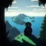
5. This particular landscape of stairs in water felt like a dream—straight out of a Ghibli movie. What I loved most was the very blue, saturated shadow between the floor and the columns. I even left part of the structure without lines, thinking it would help the white tones stand out more. Painting water is always fun. Difficult, but satisfying.

6. I really liked the values in this portrait. A big, flat shadow felt cool to me. It’s frightening to leave large areas without detail—it’s a risk, and the work can end up feeling boring. But I think the best way to learn how to balance a composition like this is by actually trying. Choose themes where that can happen, and experiment.

7. Lastly, the kitten sculpture. This might be my favourite so far—so simple, clean, and cute. I wish I could create things like this from memory. I probably should keep doing more of these. What do you think?

Here’s the process video: https://youtu.be/pqvz2CS6PZo
.
Guys, the launch of my book Life in Every Sketch was a success—thank God and thanks to you. It was fully funded in 5 hours, which honestly surprised me. There are still about 54 signed books left—go grab yours! I don’t see myself doing this again… or at least not anytime soon. Not because it was a bad experience, but because I literally tried to condense everything I’ve lived—since I was a child up to today—into this one book. Next time I have something this important to say, it’ll probably be after many more new and meaningful experiences.
Anyway, here are the two links to get a free print—use these instead of the ones on my socials to make sure you get that extra gift:
Signed book + exclusive print:
https://www.kickstarter.com/projects/1906838062/the-art-of-ramonn90?secret_reward_token=5629261e
Unsigned book + exclusive print:
https://www.kickstarter.com/projects/1906838062/the-art-of-ramonn90?secret_reward_token=89737f38

Thank you for sticking around.