Before I dive deep into the process behind my previous practices, I want to share a quick reflection on the importance of having fun while learning something new—not just in art.
While trying to help a close family member learn something very difficult, I came across an idea shared by many intellectuals I admire: learning should feel like a game. The process must feel like an invitation to explore and enjoy, not an obligation tied to external goals like making money. Learning art is tough—it requires discipline over long periods of time. Looking back, I’ve realised I got this far not because I wanted a career or income, but because I was having fun. I tried new things without constraints and shared them with others. That habit of constant exploration, I believe, was the “fun” part that kept me going and taught me the most.
Personally, I struggle to learn new things until I feel free to explore and play. I’m not great at understanding complex definitions quickly unless I act them out or apply them through practical examples. In other words, I learn by doing. Maybe many of you are the same. If that’s the case, I don’t think I can—or should—teach you how to have fun. That’s already within your reach. But what I can do is bring some awareness to this approach.
When was the last time you had fun making art—and why?
Maybe it’s time to try that again today.
.
Here’s a brief summary of what I learned from my latest practices:
1. Fish Ice Cream
This one starts with a painting approach rather than drawing, which helps me work on shape accuracy. I later use lines to refine the roughness of the “Limberto – Hard Shapes” brush strokes. In the beginning, I try to guess the silhouette, shadow placement, light direction, and colour composition by looking at the reference. It’s a bit chaotic, but if you want to try it, I suggest starting with one base colour for each element (cone, ice cream, strawberry, etc.), then adding shadows (ambient occlusion), and finally highlights. This order works better for me, since shadows often take up more space and have more complexity, while highlights are usually small.

2. Cat
What caught my attention in the reference was the highlight on the right side. The slight blue line between the rim light and the body looked really nice. I didn’t overthink why I picked this reference—I like cats, that’s it. When painting from reference, I recommend splitting the composition into two sides: light and shadow. Then, pick one to make more complex in terms of values, colours, or texture, and leave the other more flat—one value, one colour, minimal texture. This contrast creates a more balanced and harmonious image. You can see this clearly in this cat study, where most of the detail sits in the darker side.

3. Coast
Today I thought, maybe I should just paint beaches and coasts—I really like those landscapes and would love to live near one. That was my excuse to try this reference. I also liked the reflection of the sky on the wet ground at the far end of the coast. It gave me a chance to use flat values and colours, contrasted by the complexity of the rocks. Most of the visual detail is in the foreground. What I did was split the shapes above the water from those below. With landscapes, I tend to translate everything into layers—what’s near, far, above, below. This helps me adjust elements more easily. I do this intuitively, not always knowing if I’m right, just guessing as I go.

4. Black Bag
One of my warm-ups. My approach was: define the silhouette with strokes, block in the main light source (from the top), add secondary light (from the sides), and finally the highlight. I start rough and later merge values and colours using textures and soft brushes.

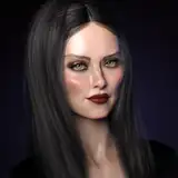
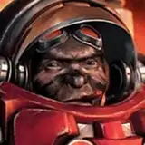
5. Portrait
I really struggled with this one. There was something in the guy’s face I couldn’t pin down—maybe the eyes, nose size, or head structure. I know there are effective ways to get proportions right using guidelines, but I don’t use them. I like to challenge myself and just observe. Honestly, I’m also kind of lazy. Luckily, I managed to get the likeness after 30 minutes. Black and white portraits helped me a lot to understand values—light and shadow. I recommend doing more like this if values or anatomy are hard for you. It’s great practice for both rendering and structural understanding.

6. Cloudy Landscape
At first, this seemed like a complex challenge because of how vast it looked. But when I broke it down into values, it became clearer. The darkest tones are under the clouds and in the sky at the top. The midtones cover the ground and horizon. The brightest value is the cloud itself. Inside each value range, the texture is almost flat because the changes are so subtle. The main challenge here was the shape edges—distant contours should look soft and blurry. I tried this kind of image for the first time, mostly because I liked the mood.

Process Videos: https://youtu.be/kjNKGcypXjE
.
If you missed the Kickstarter campaign for my book Life in Every Sketch, you can now pre-order it on the 3DTotal shop.
https://rebrand.ly/The-Art-of-RamonN90

Please let me know if you have any questions—I’ll be happy to help with art advice or book details.
Thank you for your support!