Some thoughts about my latest process
Box: Often when I choose a reference I try to make it as ordinary as I can, and a box fits exactly that requirement. Yet I'm not sure if this box I painted was an actual box from the streets or a sculpture, because I really love its shapes, and the floor in the reference looks a bit too clean. Nevertheless, after a few minutes sketching this box, I felt I didn’t need to add any other detail—just a few strokes. That kind of event doesn’t happen frequently, and when it does I know I’ve nailed something with the painting. This time I just think it was a good reference.

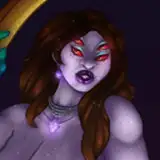
Portrait: What I liked about this reference was the colours in the skin. The light was fine, not too much texture in the hair, but the combination of skin tones and makeup did feel like a feast for colours and textures. In the past, I used to recommend painting portrait pictures in which there’s a hand or two, interacting in some way—maybe holding something, maybe touching something. I don’t know why, but I think this is visually attractive. Maybe it’s because of how complex hands are and how shapes can create a three-dimensional effect, like distorting a surface in a flat 2D artwork.

Ice cream: This one was a headache for me. I saw the reference and immediately wanted to eat ice cream. I took that as a good sign and imagined people would fall for it as well. But after enough time I noticed it was a nightmare in terms of shapes—it really needed to be rendered the right way in order to look like ice cream and not a piece of abstract art. It looked like everything but ice cream. What did I learn? Next time I either must have more time to figure out these challenges, or I just pick a reference in which I can define the shape silhouette of the subject. This way, if the texture or shapes within the subject are not properly recreated, at least the silhouette can make the subject understandable.

Can: In principle I love the values in this reference—very well defined from each other: the highlight, middle tone, shadows, and some other lights in the borders of the silhouette. So, something interesting happened to me with this one. As you know, I position values using a hard-edge brush and then refine the transitions between these values by using brushes with more complex textures—this in order to add more information into the render. Yet I kept deleting these textured refined layers on top of the rough hard-edge values. I quite liked the very first attempts I accidentally painted in order to know where the highlight would be and later the shadows. Eventually, I decided to keep it this way. This is something I’ve always searched for—a way to make something quick I like—but eventually I end up making the composition more and more complex. I hope I don’t run out of this luck or maybe... I’m just getting comfortable with fewer strokes.

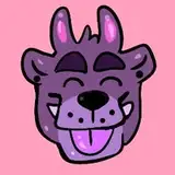
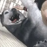
Bear: In search of an animal to paint, I found this reference, which I believe was a meme a long time ago. I thought it would be cool if the mother bear became ten times bigger in my practice, while the cub remained very small. I realised making the cub way too small would lose visibility at first sight. The way I approach compositions in which there’s a person or animal (in this case) and a background is by using the line art to define the most important points of interest—in this case the bear’s face and the cub’s whole body—as well as some big shapes of the cave, but not in detail, as these are mostly for shape silhouette distinction. Then, below that, I use values to boost that volume.

This render was a bit more complex at the end because of the amount of values I chose for everything around the cub. I unconsciously decided not to render the cub that much. Now that I’m describing it, I’ve noticed that maybe that was the way I wanted to balance the information.
Tunnel Bridge: Lastly, during that day I wanted to paint something that made me feel good—a green, fresh place with a clear sky and some sun. My approach was the same as for the previous practice: lines for splitting big shapes (basically the bottom from the sky), defining a bit of the perspective, and splitting layers in which colours and values might differ from other layers. In this particular practice, you will see how I managed to create depth by adding layers of blue light between the shapes at the back—the further the shapes are (like trees and mountains), the clearer their values should be. And a feature of nature is that they also end up looking a bit colder through blue tones.

Process Video: https://youtu.be/_CcrmRkSrWY
Brushes: https://drive.google.com/drive/folders/1wHu8wuEHjDk-VfnZqv8iy8rwnvu8Ngmj?usp=sharing
.
Hi there!, remember you can now pre-order my book Life in Every Sketch on the 3DTotal shop.
https://rebrand.ly/The-Art-of-RamonN90

Please let me know if you have any questions—I’ll be happy to help with art advice or book details.